

Transforming rooms through the emotional language of color
Have you ever walked into a room and immediately felt calm, energized, or even slightly uneasy? That's color working its silent magic. When it comes to WPC wall panels, color isn't just about aesthetics - it's an emotional communicator that shapes how we experience spaces. Let's explore how different hues transform environments and influence our daily moods.
Colors speak directly to our subconscious. In residential and commercial applications, the right palette creates harmony between functionality and emotion. WPC panels bridge practicality and beauty - they're durable, moisture-resistant eco-friendly building materials that also deliver remarkable visual impact.
Real talk : Your wall color choice affects more than Instagram appeal - it changes how people interact with your space. Cool tones can increase perceived productivity by 15% in offices, while warm hues boost appetite in restaurants. Now that's smart design!
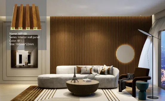
Picture morning light streaming through birch trees. That's the magic of light oak WPC panels. They don't just brighten spaces - they create an illusion of expanded room dimensions. Perfect for compact apartments where every square foot counts. Unlike real wood that yellows over time, these maintain their crisp, clean appearance for years without special treatment.
Psychology in action : Promotes mental clarity and reduces anxiety. Patients in medical waiting areas report feeling 20% calmer surrounded by these tones.
There's something undeniably luxurious about walnut tones. They wrap a room like a fine leather armchair - comforting yet refined. The deep browns with reddish undertones create intimate atmospheres in open-concept spaces. Ideal for creating cozy nooks in oversized living areas.
Psychology in action : Stimulates conversation and connection. Dining rooms with walnut features see guests staying 30% longer on average.
The Goldilocks of wood tones - not too light, not too dark. Teak delivers year-round versatility, looking equally stunning with summer florals and winter evergreen decor. Its balanced warmth makes it a chameleon that adapts to changing interior trends without appearing dated.
Psychology in action : Creates transitional zones that reduce mental fatigue. Perfect between work and living spaces in WFH setups.
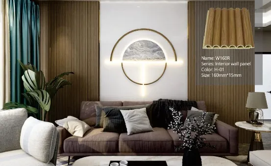
Move over, basic beige! Greige - that perfect marriage of gray and beige - offers modern warmth without the yellow undertones that date interiors. It's become the Swiss Army knife of designers, creating blank canvases that make artwork pop while maintaining character.
Far from depressing, deep gray brings dramatic sophistication. It turns ordinary walls into striking backdrops that make furniture and decor elements shine. Excellent for hiding imperfections in older buildings while creating contemporary contrast with metal finishes.
The ultimate space enhancer. White WPC panels reflect maximum light, making them essential for windowless bathrooms and narrow hallways. Creates that "just-cleaned" feeling 24/7. Modern matte finishes prevent the sterile look of gloss whites.
Pro tip : Mix neutrals strategically! Try charcoal baseboards with greige walls for dimension without visual chaos. Neutrals aren't boring - they're sophisticated support players.
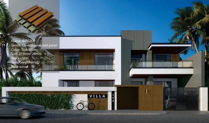
More than just a color - it's an experience. Navy and sapphire tones create enveloping atmospheres that feel like being submerged in peaceful waters. Particularly transformative in bedrooms, promoting deeper sleep and longer REM cycles according to sleep studies.
Bringing Mediterranean sunshine indoors. These clay-inspired hues generate instant warmth in cold climates and northern-facing rooms. Surprisingly versatile when paired with both natural fibers and modern metallic finishes.
Forget "just green" - emerald makes statements without shouting. It pairs brilliantly with brass accents and deep wood tones, creating spaces that feel simultaneously grounded and luxurious. Studies show it stimulates creative thinking better than any other color.
| Living Areas | Warm teak or walnut tones encourage conversation • Light grays boost relaxation during movie nights • Avoid stark whites which feel too clinical |
| Kitchens | Light oak maintains airy feel • Greige hides cooking splatters better than pure white • Blue backsplashes suppress appetite (great for diets!) |
| Bedrooms | Soft blues promote quality sleep • Deep charcoals create intimacy • Terracotta warms cold floor surfaces at night |
| Home Offices | Light oak improves focus without glare • Emerald green walls stimulate problem-solving • Avoid yellow tones which cause eye fatigue |
| Retail Spaces | Greige provides neutral background for products • Walton brown increases perceived product value • Strategic navy accent walls guide customer flow |
| Restaurants | Terracotta stimulates appetite • Teak creates warmth for fine dining • Avoid blues near dining areas |
Lighting Matters : Always test swatches at different times! North-facing rooms need warm tones to combat blue light • South-facing spaces can handle cooler palettes • Artificial lighting changes everything - warm bulbs make grays look beige
Sample Testing Protocol : Get large samples (min. 12"x12") • Tape to walls • Observe at 8AM, noon, and 8PM for 3 days • View under artificial lighting • Check against flooring samples
Future-Proofing : Choose dominant colors from timeless categories (75% neutral/wood) • Use bolder shades on accent walls (15%) • Reserve intense colors for removable elements (10%)
Maintenance Reality Check : Matte finishes hide imperfections • Slightly textured surfaces disguise fingerprints • Dark grays conceal dirt between cleanings • Smooth light panels reflect more light but show flaws
Choosing WPC panel colors transcends mere decoration - it's environmental psychology. Your wall palette influences moods, behaviors, and perceptions every single day. By understanding color relationships with space, light, and function, you create experiences, not just interiors. Remember: the most successful spaces tell emotional stories through color progression from room to room. Let your walls speak your design philosophy.
Recommend Products











