

Ever walked into a tiny bathroom or narrow kitchen and felt instantly claustrophobic? That sinking "boxed-in" feeling is universal in small spaces. But here’s the secret real designers won’t bill you for: your wall tiles hold the magic key to flipping that cramped sensation into airy liberation.
This isn’t just about aesthetics – it’s visual psychology. The right tile choices create illusions your brain can’t resist believing. Think of them as silent architects that redesign spatial boundaries without moving walls. Let’s unravel the golden rules that turn limited square footage into limitless possibility.
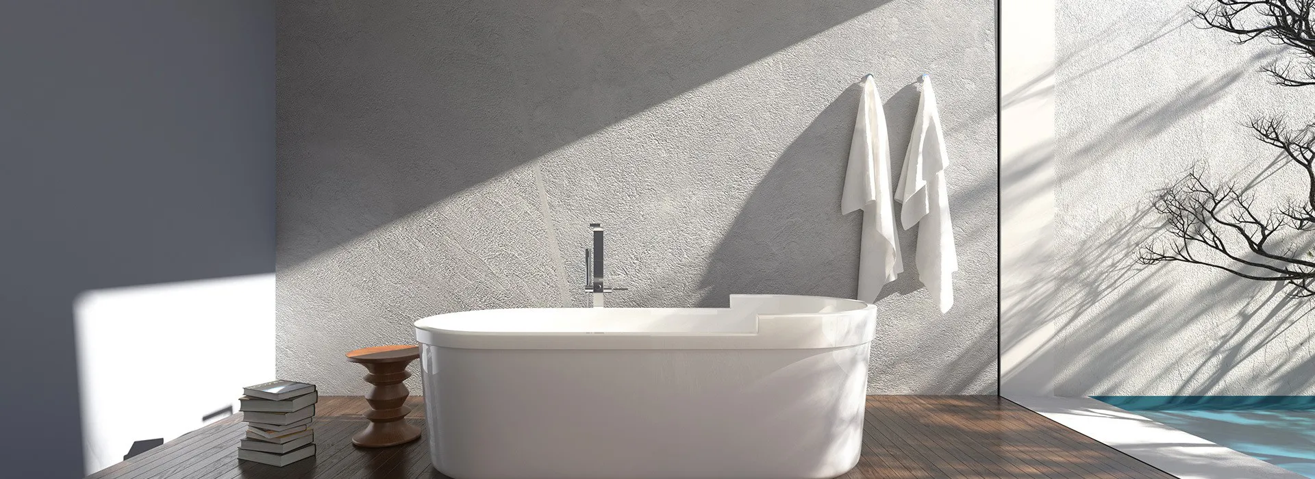
The 80/20 Rule of Spatial Deception
Picture this: You’ve got two identical 6x6 ft. bathrooms. One uses dark marble-look tiles floor-to-ceiling. The other combines large matte-white wall tiles with vertical glossy strips. Despite identical dimensions, the second feels substantially larger. Why?
Space Shrinker
Dark colors absorb light, shortening walls visually
Space Expander
Light-reflective surfaces bounce illumination further
In small spaces, light is currency . Glossy finishes act like mirrors – amplifying natural and artificial light sources. Matte ceramics? They’re light sponges. The 80/20 rule suggests: dedicate 80% of walls to reflective light-toned ceramic wall materials (white/ivory/light grey) and 20% to strategic accent bands that guide the eye vertically.
Directional Dynamics: The Geometry Trick
Tiles aren’t passive rectangles – they’re visual narrators. Grout lines become directional arrows telling your eyes where to travel. Horizontal lines? They widen walls like bookends closing in. Vertical lines? They pull gaze upward, creating imaginary height.
Case Study: The 7ft. Ceiling Dilemma
A cramped Chicago condo bathroom gained 14 inches of "felt height" by:
- Switching from mosaic tiles to 12x24 inch slabs
- Rotating layout vertically from floor-to-ceiling
- Matching grout color precisely to tile pigment
The result? Disappearing seams that blurred boundaries. When grout contrast is high, patterns chop walls like butcher blocks. Low-contrast grout creates continuous flow – gravity’s illusion working for you.
Texture: Your Secret Refraction Tool
Smooth surfaces behave like calm lakes – mirroring surroundings crisply. Textured ones? They’re choppy oceans diffusing light. This refraction principle makes subtly rippled tiles ideal depth-generators:

Gentle waves = soft shadow play

3D patterns = dynamic light angles
For tight corridors, consider ribbed or fluted tiles. Their linear grooves scatter light along their length, effectively "stretching" walls. Porcelain beats ceramic here – its density allows deeper textures without compromising durability. Think sculptural function over flat decoration.
Size Illusions: Breaking Tile Myths
"Big tiles for big spaces" is outdated thinking. Actually, fewer grout lines in expansive slabs create uninterrupted planes ideal for cramped quarters. But there’s nuance:
24×48" slabs
Maximize seamlessness
Require perfect walls (waviness shows)
4×16" subway
Forgiving on uneven surfaces
Can feel busy if misaligned
Hexagons
Disguise irregular dimensions
Require intricate cutting
For renters or DIYers, consider large-format vinyl tile alternatives – they deliver the visual effect without permanent commitment. Modern LVT mimics ceramic textures so convincingly, even designers do double-takes.
Color Psychology: Beyond "White Makes Big"
While light tones are fundamental, monochrome palettes backfire by creating featureless voids. The human eye needs depth cues. Solution? Layered neutrals:
Sample layered neutral scheme using warm beiges
Implement the "shade progression" technique: darkest at floor level, graduating lighter upward. This mimics how light naturally falls in open environments. Adding a 6-inch band of metallic mosaic at eye-level? That catches and throws light like a luminous belt pulling the walls outward.
The 5 Fatal Tile Choices That Shrink Rooms
Avoid these tempting traps:
- High-contrast checkerboards – fragments floors into puzzle pieces
- Decorative borders at chair-rail height – chops walls visually
- Super-dark accent walls – pushes boundaries inward
- Busy murals – hypnotic patterns freeze spatial perception
- Matching floor/wall tiles – erases definition of volume
Instead of borders, use texture bands . Swap murals for tonal gradient tiles . replace monochrome with cousin hues (e.g., pearl + oyster + stone).
Your Blueprint in 4 Measurements
Before choosing tiles, arm yourself with:
- Light meter readings at 8am, noon, and dusk
- Wall flatness % – use a 6ft. level to detect bumps
- Primary sightlines mapping – where eyes land entering room
- Fixture focal points – tubs/windows that dictate tile breaks
These become your cheat codes. Low natural light? Prioritize reflectivity over color. Significant wall warping? Lean toward smaller formats or textured surfaces that disguise imperfections. Sightline data reveals where large slabs will have maximum impact.
Spatial Alchemy in Practice
The true magic lies in making limitations vanish through perception. A well-executed tile scheme doesn’t just decorate walls – it redesigns reality. By mastering light manipulation, directional guidance, and conscious material selections like durable ceramic wall materials, you reclaim control over spatial experience.
Your tiny bathroom becomes a serene retreat. That narrow galley kitchen transforms into a luminous culinary studio. Remember: in the realm of perception, less square footage doesn’t mean less possibility – just smarter invitations for light and gaze to dance. Now go rewrite your walls’ story.