Hey there, fellow design lovers! You know that magical feeling when you step into a room and everything just... works? The colors whisper to each other, the textures hug, and the space feels like a warm embrace? That's what we're chasing when blending Japanese tatami with Western interiors. Let's ditch the stiff design rules and chat like friends sipping matcha about how to create harmony between tatami mats, wall colors, and furniture.
Japanese tatami isn't just flooring—it's mood lighting, temperature control, and Feng Shui master all woven into straw. These beautiful mats naturally glow with warm beiges and subtle greens, creating a serene foundation. But here's the secret: they're like your most low-key friend who shines brightest when everyone else tones it down.
Picture this: You've scored gorgeous antique tatami mats with that perfect honeyed patina. Then you plop down a hot pink sofa. Suddenly, it's less "zen retreat" and more "80s disco nightmare." Tatami speaks in whispers, not shouts. Its quiet elegance demands thoughtful color coordination that respects its cultural roots while suiting modern lifestyles.
Traditional tatami rooms follow shin-gyo-so principles: formal ("shin"), semi-formal ("gyo"), and casual ("so"). For Western homes, we're usually in "so" territory—think relaxed, livable spaces where shoes stay on, and Netflix marathons happen. This informs our color choices: less rigid tradition, more calm comfort.
Sunlight transforms tatami from sleepy to sensational. Rooms with south-facing windows? Gold. The way morning light hits tatami makes the fibers glow like woven sunshine. North-facing rooms can work too—just lean into cooler undertones.
Artificial lighting tip: Warm LEDs (2700K-3000K) mimic sunset on tatami. Avoid clinical fluorescents unless you want your peaceful retreat to feel like a dentist's office.
Tatami loves the great outdoors, so bring nature inside. Think beyond boring beige to:
Muddy sage greens, stone greys, soft clays. These make tatami pop naturally. A mossy accent wall behind tatami feels like bringing the garden indoors.
Pale aquas, misty blues, duck egg. Cool tones balance tatami's warmth. Especially magic in minimalist rooms—blue walls + tatami = instant spa day.
Walnut, oak, cedar tones—especially if you've got wood accents. Stick to muted stains, not orangey varnishes. Tatami and wood are old friends who harmonize beautifully.
Colors to avoid? Anything that screams for attention: electric yellows, traffic-cone oranges, Instagram-neon pinks. Your tatami will feel visually bullied.
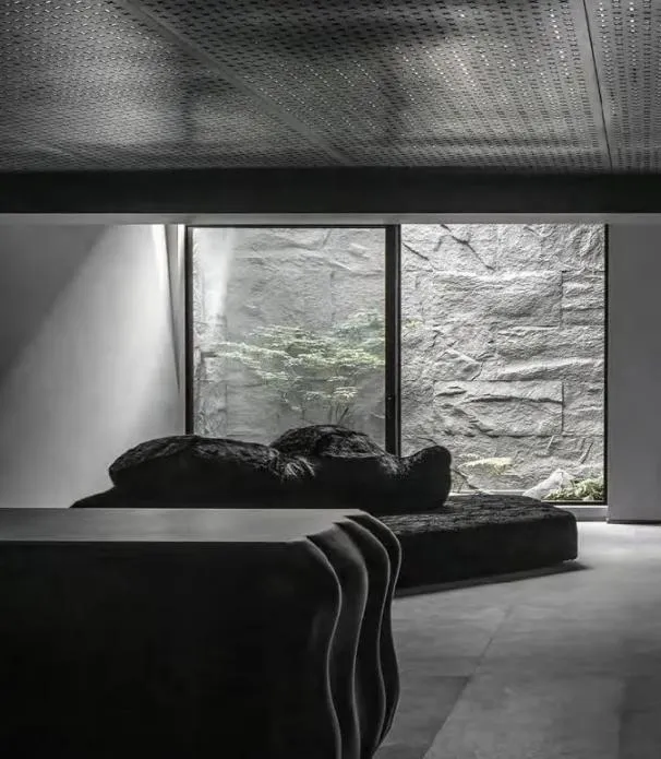
Here's where Japanese philosophy shines: emptiness isn't lacking—it's breathing room. Don't cram furniture onto tatami like a yard sale. The mats themselves are design elements. Floating shelves > bulky bookcases. Low platform beds > four-poster monsters.
True story: My client Jessica insisted on keeping her oversized sectional in the tatami zone. It looked like a sumo wrestler at a ballet. Solution? We swapped for a streamlined daybed with washed linen upholstery—instant harmony. When tatami can "see" itself, everybody wins.
Furniture near tatami needs ground rules:
Elevated furniture (like hairpin-leg consoles) keeps sightlines flowing over tatami instead of crowding it.
Zabuton cushions, chabudai tables—even if just in one corner—say "I respect the tatami vibes" in English or Japanese.
Rough linen sofas, rattan chairs, nubby wool rugs—natural textures flirt with tatami instead of competing.
Accessories set the mood: one killer ikebana arrangement > ten generic vases. Why? Tatami rooms embody wabi-sabi—flawed beauty. Let one showstopper branch dominate rather than fussy arrangements.
For color accents, pull from existing elements—a cobalt glaze on pottery, persimmon velvet cushion, or moss-agate coasters. Keep it subtle, like jazz improvisation rather than marching band precision.
Already have bold walls? Don't panic! Deep forest green or midnight blue can work with tatami if you:
- Add plenty of "light breathing room"—uncluttered zones
- Introduce transitional textures like sheer curtains
- Place tatami near windows to maximize its natural glow
Got a red velvet Victorian couch? Can work! Ground loud pieces with neutral rugs (like jute or sea grass) between furniture and tatami. Or embrace eclectic style but repeat the accent color elsewhere—maybe in a single framed ukiyo-e print.
- Walls: Benjamin Moore "Silvery Blue"
- Tatami: Natural green-tone mats
- Furniture: Oak platform bed, white linen curtains
- Secret Weapon: Handmade cerulean ceramic vase with one branch
Why it works: Cool walls and tatami greens create peaceful retreat vibes against city noise.
- Walls: Clay plaster finish
- Tatami: Antique gold straw mats
- Furniture: Mushroom-toned low sofa, antique wooden chest
- Secret Weapon: Tatami-edged reading nook under sloped ceilings
Why it works: Earthy textures tell a cohesive story.
- Walls: Dove grey
- Tatami: Pale ivory mats
- Furniture: Matte black ebonized oak dining set
- Secret Weapon: Single dramatic ikebana in charcoal vessel
Why it works: Tatami prevents sterility by adding organic warmth.
Pro Tip: Tatami sections in Western homes work best near natural elements—under a bay window, adjoining a patio, or below a skylight. Think "therapeutic escape," not just flooring.
Modern tatami mats are durable, but sun-fading happens. Rotate mats yearly like sushi chefs. Spills? Blot—don't scrub! Regular airing prevents mustiness. Consider bamboo charcoal deodorizer panels for freshness—they've kept imperial palaces smelling crisp for centuries.
Designing with tatami isn't about rigid rules—it's about sensitivity. Like a good poem, what's unsaid matters most. Those empty corners? That's where tranquility lives. The play of light on straw? That's rhythm. When walls, furniture, and tatami harmonize, you create spaces that don't just look beautiful—they feel restorative. So tune into tatami's quiet wisdom. Let it teach you the art of space, the grace of restraint, and the profound beauty of whispering colors. Your soul—and your Instagram—will thank you.
Recommend Products