Walk into any room, and before you notice the furniture layout or the texture of the walls, it's the colors that hit you first. They wrap around you like a silent language, telling you whether the space is calm or energetic, cozy or spacious, outdated or fresh. That's the power of color—and when paired with the right interior decoration materials, it becomes the backbone of a room's personality. But here's the thing: choosing colors isn't just about picking what looks pretty in a swatch book. It's about understanding how hues interact, how materials influence their perception, and how to craft a palette that feels intentional and alive. In this guide, we'll unpack the basics of color theory and show you how to apply it to materials like porcelain slab tile for wall, bamboo charcoal board wall panel, and terrazzo tile, turning your space from "meh" to "magic."
You don't need a degree in fine arts to "get" color theory. At its core, it's simply the study of how colors work together—and how they make us feel. Think of it as a toolkit: learn the rules, and you'll know when to follow them, when to bend them, and when to break them (yes, even that bold red accent wall can work if you do it right). Without this toolkit, you might end up with a room where the walls clash with the flooring, or the undertones of your countertop fight with your backsplash—leaving you with a space that never quite feels "finished."
Take it from someone who's seen it all: I once visited a friend's kitchen where she'd painted the walls a soft "greige" (gray + beige) and installed white cabinets, thinking it would be neutral and calming. But something felt off. The more I looked, the more I realized: the greige had a subtle pink undertone, and the cabinets, under the warm kitchen lights, leaned yellow. Those hidden hues were quietly clashing, making the room feel disjointed. A little color theory knowledge could have saved her from repainting six months later.
So let's start with the basics—the building blocks that will help you match hues like a pro.
You've probably seen it before: a circular diagram with colors arranged in a rainbow. That's the color wheel, and it's the foundation of color theory. Let's break it down:
But the color wheel isn't just about names—it's about relationships. Colors next to each other (analogous) feel harmonious, while colors opposite each other (complementary) create bold contrast. For example, blue and orange are complements; place them together, and they make each other pop. Red and green? Also complements (hello, Christmas!), but use them carefully, or you'll end up with a space that feels more holiday display than home.
Pro Tip: When in doubt, start with a "neutral base" and add pops of color. Neutrals (beige, gray, white, black) are the glue that holds a palette together, and they let materials like WPC wall panel or granite stone shine without overwhelming the eye.
Colors aren't just "red" or "blue"—they also have a temperature. Warm tones (red, orange, yellow, and their derivatives) feel energetic and cozy. They remind us of sunlight, fireplaces, and autumn leaves. Cool tones (blue, green, purple) are calming and refreshing, like a quiet forest or a clear sky. Then there are neutrals, which can lean warm (beige with a yellow undertone) or cool (gray with a blue undertone)—and those undertones? They're the secret saboteurs (or heroes) of many a room.
Let's see how this plays out with real materials:
Warm tones are perfect for spaces where you want to encourage connection: living rooms, dining areas, bedrooms. They make large rooms feel smaller and more intimate, and they pair beautifully with natural materials that have earthy textures.
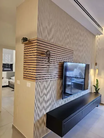
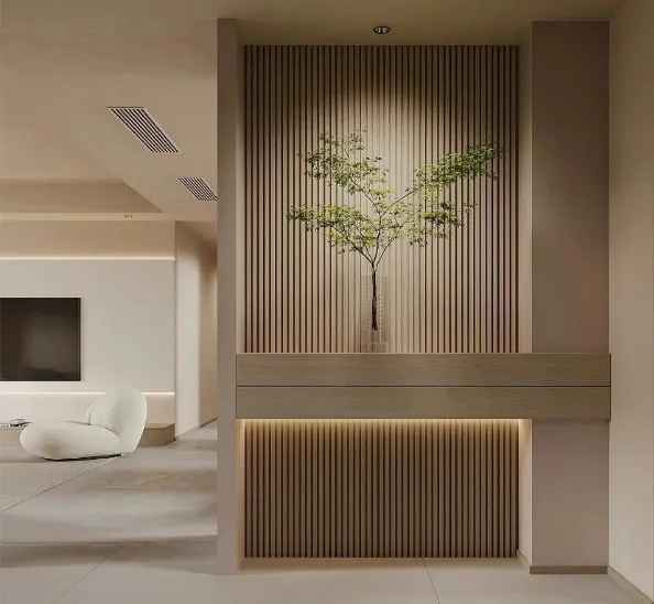
Bamboo charcoal board wall panel is a star here. These panels, made from compressed bamboo fibers and activated charcoal (hello, air-purifying benefits!), often mimic the look of real wood—think light oak, walnut, or teak. Their warm browns and ambers have a built-in coziness that makes a bedroom feel like a retreat or a living room feel like a hug. I worked with a client once who used walnut-toned bamboo charcoal panels in her home office; paired with a mustard yellow accent chair and warm white curtains, the space felt productive but never sterile—like working from a cabin in the woods, minus the mosquitoes.
Another warm-toned winner? Granite stone . While it's often associated with cool grays and blacks, granite comes in stunning warm hues too: peach-toned "New Venetian Gold," with its flecks of amber and cream; "Giallo Ornamental," a buttery beige with golden veins. These stones add richness to kitchens and bathrooms, especially when paired with warm wood cabinetry or brass fixtures. Just be mindful of undertones: some granites labeled "beige" have pink or orange hidden beneath the surface, which can clash with cool-toned tiles.
Cool tones are your go-to for rooms where you want to relax or focus: bathrooms, home offices, bedrooms (yes, bedrooms can go cool too—think a serene blue that lulls you to sleep). They make small rooms feel larger and brighten spaces with limited natural light.
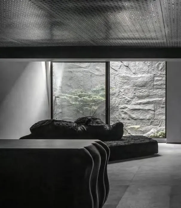
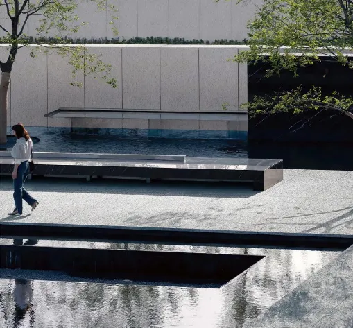
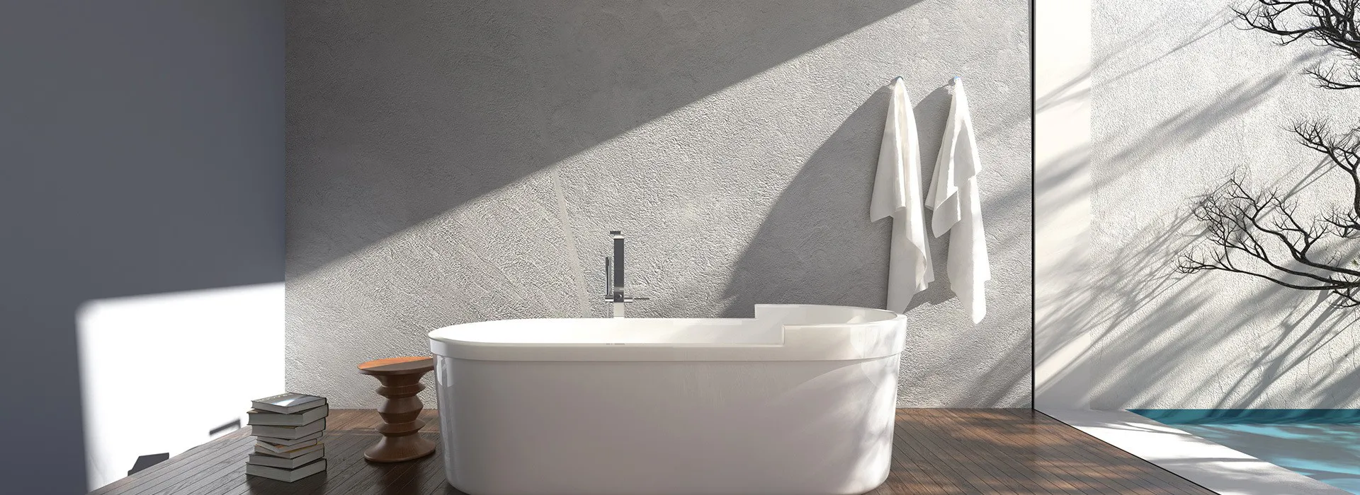
Porcelain slab tile for wall is a cool-toned champion. These large-format tiles (often 6x12 feet or bigger) have a sleek, non-porous surface that holds color like a pro—no fading, no staining, just vibrant hues that stay true. I recently helped a client install 10-foot-tall porcelain slabs in a soft sky blue for her bathroom walls. The color, paired with white fixtures and chrome hardware, turned a cramped, dark bathroom into a spa-like oasis. The key? She chose a matte finish instead of glossy, which toned down the blue's intensity and kept the space calming, not cold.
Then there's WPC wall panel (wood-plastic composite), a durable, moisture-resistant option that's perfect for bathrooms, basements, or high-traffic hallways. WPC panels come in cool grays, soft greens, and even pale blues—hues that feel modern and fresh. A client used light gray WPC panels in her home gym, and paired them with black rubber flooring and white workout equipment. The cool palette kept the space feeling energizing but not overwhelming, even during 6 a.m. sweat sessions.
If there's one thing you take away from this guide, let it be this: always check the undertones . A color that looks "beige" in the store might reveal a pink, yellow, or gray undertone under your home's lighting—and that undertone will dictate how it plays with other materials.
Take terrazzo tile , for example. These tiles are made by mixing marble, granite, or glass chips into a cement or resin base, creating a speckled, retro-chic look. They're trendy, yes, but their undertones can be tricky. A terrazzo with white chips and a gray base might look "neutral," but if the gray has a green undertone, it could clash with a blue rug or purple curtains. On the flip side, terrazzo with warm beige chips and a cream base would play nicely with bamboo charcoal board wall panels or oak flooring.
How to spot undertones? Look at the material in natural light and artificial light (both warm and cool bulbs). Hold it next to a pure white piece of paper—the undertone will start to show. For example, a "white" porcelain slab tile might look crisp white under daylight but take on a yellow tinge under incandescent bulbs. That's why it's crucial to take samples home and test them in your space before committing.
Color isn't just about hue—it's also about how the material itself interacts with light. A glossy surface will reflect light, making colors look brighter and more intense. A matte surface absorbs light, softening the color and adding depth. Texture, too, plays a role: a rough, honed terrazzo tile will make colors feel more muted than a polished one, even if they're the same hue.
Let's break it down:
Fun Experiment: Grab two samples of the same color—one glossy, one matte. Hold them up to a window. See how the glossy one seems to "glow" while the matte one feels more grounded? That's the power of finish. Use this to your advantage: pair a glossy accent wall with matte flooring to balance intensity, or use all matte materials in a small room to avoid overwhelming the eye.
Now that you know the basics, let's talk about schemes —the combinations of colors that will tie your space together. There are four main ones to know, and each works with different materials and room functions.
Monochromatic schemes use different shades, tints, and tones of a single color. Think light gray walls, medium gray WPC wall panel, and dark gray flooring. It's elegant, cohesive, and impossible to mess up—great for beginners or anyone who loves a minimalist vibe.
Terrazzo tile shines here. Look for tiles with aggregates in varying shades of the same color: a white terrazzo with white and off-white chips, or a gray terrazzo with light and dark gray flecks. Pair it with a monochromatic wall color, and you've got a space that feels calm and intentional. I used this approach in a client's bathroom: soft gray walls, gray terrazzo floor tiles, and a white porcelain slab tile backsplash (white is a tint of every color, so it fits!). The result? A spa-like retreat that's both modern and timeless.
Analogous schemes use colors that sit next to each other on the color wheel—like blue, blue-green, and green; or red, red-orange, and orange. They're harmonious and easy on the eye, making them perfect for large rooms or open-concept spaces where you want a sense of flow.
Porcelain slab tile for wall is ideal here. Imagine a kitchen with sage green lower cabinets, a mint green porcelain slab backsplash, and soft white upper cabinets (white acts as a neutral buffer). The analogous greens create a cohesive look that's fresh and calming. Add brass hardware (a warm metallic) to tie in the undertones, and you've got a space that feels intentional without trying too hard.
Complementary schemes pair colors opposite each other on the wheel: blue and orange, red and green, purple and yellow. They're high-energy and attention-grabbing—great for accent walls, backsplashes, or small spaces where you want to make a statement.
Granite stone is a natural fit for complementary schemes. Take "Ubatuba Granite," a deep green stone with flecks of gold and black. Pair it with a warm orange subway tile backsplash, and you've got a kitchen that's bold but balanced (the black in the granite tones down the orange). I once saw this combo in a beach house, and it was stunning—the green felt like the ocean, the orange like a sunset, and together, they screamed "vacation."
Proceed with caution, though: complementary colors are intense. Use them in small doses (an accent wall, a backsplash) rather than covering the entire room. And stick to one pair—two complementary pairs (say, blue-orange and red-green) will turn your space into a circus.
Triadic schemes use three colors equally spaced on the wheel: red, yellow, blue; or orange, green, purple. They're playful and vibrant, perfect for creative spaces like home offices or kids' rooms. The key is to balance them: pick one dominant color, one secondary, and one accent.
Terrazzo tile with multicolored aggregates is made for triadic schemes. Imagine a terrazzo with blue, yellow, and red chips (a classic primary triad). Use it as a flooring in a home office, then paint the walls a soft white, add a blue desk chair, and hang yellow artwork. The terrazzo ties the colors together, while the white walls keep the space from feeling chaotic.
To make it easy, here's a breakdown of our star materials, their color options, and which schemes they shine in. Keep this handy when you're shopping for samples!
| Material Type | Common Color Options | Texture/Finish | Best For (Room Type) | Ideal Color Scheme |
|---|---|---|---|---|
| Porcelain Slab Tile for Wall | White, Gray, Beige, Blue, Green, Terracotta | Glossy, Matte, Polished, Textured (Stone/Marble Look) | Kitchen Backsplashes, Accent Walls, Bathrooms | Complementary (Bold Accents), Monochromatic (Neutrals), Analogous (Greens/Blues) |
| Bamboo Charcoal Board Wall Panel | Light Oak, Walnut, Teak, Beige, Warm Gray | Matte, Wood Grain, Smooth | Bedrooms, Living Rooms, Home Offices | Warm Analogous (Browns/Ambers), Monochromatic (Neutral Woods), Complementary (Wood + Blue/Green) |
| WPC Wall Panel | White, Gray, Brown, Black, Soft Green, Blue | Matte, Wood Grain, Subtle Texture | Hallways, Bathrooms, Basements, High-Traffic Areas | Neutral Monochromatic (Grays/Whites), Cool Analogous (Blues/Greens), Triadic (Small Accents) |
| Terrazzo Tile | Multicolored (Marble Chips, Glass Aggregates: White, Black, Blue, Green, Red, Yellow) | Polished, Honed, Textured | Bathrooms, Entryways, Kitchen Floors, Accent Walls | Analogous (Mixed Tones), Triadic (Primary/Secondary Chips), Complementary (Bold Aggregates) |
| Granite Stone | Black, White, Red, Blue, Green, Beige (With Natural Veins/Flecks) | Polished, Leathered, Honed | Kitchen Countertops, Fireplaces, Outdoor Patios | Complementary (High-Contrast Veins), Monochromatic (Neutral Stones), Analogous (Earthy Tones) |
Now that you're armed with color theory knowledge, let's turn it into action. Here's how to apply what you've learned to your own space:
Fixed elements are the ones you can't easily change: flooring, countertops, large appliances. These should be your color anchors. If you're building a new space, pick these first. If you're renovating, work with what you have. For example, if your floors are a warm oak (brown with yellow undertones), lean into warm tones for your walls and cabinetry.
Lighting changes everything. A material that looks gray in the store might look blue at noon, green in the afternoon, and purple under evening lights. Grab samples of your chosen materials (porcelain slabs, bamboo panels, terrazzo tiles) and tape them to the wall or lay them on the floor. Check them in the morning (natural light), midday (bright sun), and evening (artificial light). If the color still works in all three, you're good to go.
A bedroom needs to be calming (cool tones, soft neutrals), a home gym energizing (bold accents, warm tones), a bathroom clean and fresh (light neutrals, cool blues/greens). Let the room's purpose guide your palette. I once designed a meditation room with soft gray WPC wall panels, a white porcelain slab floor, and a lavender accent wall—it was the perfect mix of calm and warmth, and my client said she fell asleep faster than ever.
This classic design rule keeps palettes balanced: 60% dominant color (walls, large furniture), 30% secondary color (flooring, curtains), 10% accent color (art, pillows, small decor). For example: 60% warm white walls, 30% walnut bamboo charcoal board wall panel, 10% mustard yellow throw pillows. It works every time.
Color theory isn't about stifling your creativity—it's about giving you the confidence to trust your instincts. When you understand how hues interact, how materials like porcelain slab tile for wall or terrazzo tile influence their perception, and how to balance warm and cool tones, you'll stop second-guessing yourself and start creating spaces that feel like "you."
Remember: the best rooms aren't perfect—they're authentic . Maybe you love bold colors, so you go for a complementary scheme with granite stone and porcelain tile. Maybe you prefer calm, so you stick to monochromatic neutrals with bamboo charcoal panels. Either way, let color theory be your guide, not your jailer.
Now go forth and paint (or panel, or tile) with confidence. Your dream space is just a few hues away.
Recommend Products