Ever notice how food looks kinda "blah" under cheap LEDs? Or how your favorite shirt looks duller under bathroom lighting? That's the hidden magic (or tragedy) of CRI – the Color Rendering Index. Today we're cutting through the specs to explore how choosing between CRI 80, 90, and 95+ lighting actually impacts daily life. Spoiler: It matters way more than you think for both your mood and your wallet.
CRI scores measure how faithfully lights reveal colors compared to natural sunlight. Picture the difference between bargain-bin Christmas lights versus museum-quality illumination. On the 1-100 scale:
Typical real-world performance:
| CRI Level | Best For | Avoid In | Cost Premium |
|---|---|---|---|
| CRI 80 | Garages • Storage closets • Utility rooms | Kitchens • Bathrooms • Anywhere you judge colors | Standard pricing (baseline) |
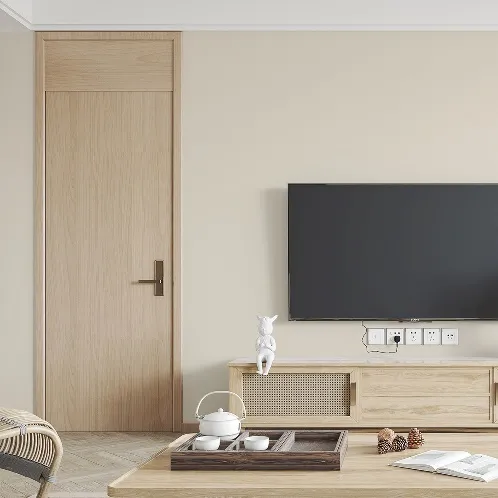
| CRI 90 | Living rooms • Bedrooms • Home offices • Retail spaces | Art studios • Luxury retail • Makeup areas | ~20% more than CRI 80 |
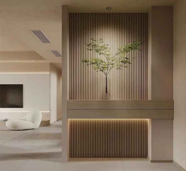
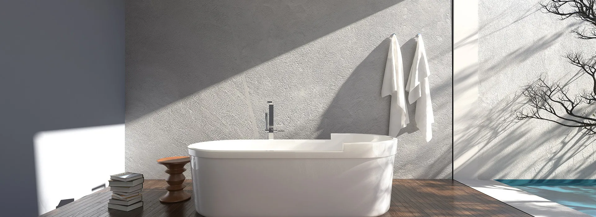
| CRI 95+ | Art galleries • Kitchens • Boutiques • Photography • Premium architectural lighting solutions | Places where lighting quality doesn't impact function | ~35-50% more than CRI 80 |
Here's the kicker: Switching from CRI 80 to 90 LED panels in a kitchen reduces food waste. People spot spoiled items faster and accurately judge meat doneness. In clothing stores, this lighting shift can lift sales by 10-15% as colors "pop" authentically.
Higher CRI typically means 5-15% less efficiency. But smarter strategies exist:
Long-term costs flip the script too. High-end LEDs last longer. Philips' 95 CRI bulbs average 25,000 hours vs 15,000 for budget 80 CRI equivalents. The $40 premium pays back within 2 years in reduced replacements.
Three scenarios where premium CRI delivers disproportionate returns:
One homeowner actually reported: "Upgraded to CRI 95 bathroom LEDs and suddenly my foundation shade disasters stopped happening. Who knew bulbs were cheaper than new makeup?"
The golden lighting ratio: Spend premium CRI dollars where you interact with colors daily:
| Room | Recommended CRI | Why It Matters |
|---|---|---|
| Kitchen Counters | 95+ | Food safety • Ingredient freshness • Cooking accuracy |
| Bathroom Vanity | 90-95+ | True skin tones • Precise makeup • Towel color matching |
| Home Office | 90+ | Reduce eye strain • Accurate document colors |
| Living Room | 90 | Relaxed viewing • Decent color without glare |
| Closets | 80 | Just find clothes - no color judgments needed |
Interior designer Melissa Rossi notes: "Using strategic CRI 95 spots above art pieces creates gallery moments, while keeping ambient lighting at 90 saves 30% on lighting budgets."
2024 brings game-changers:
Lighting historian David Chen observes: "We're exiting the 'dumb bulb' era. Within 5 years, choosing CRI will feel as normal as picking wattage was for our grandparents."
Based on thousands of installations:
The truth? You'll never notice CRI... until you do. Then suddenly - fabrics regain richness, meals look Instagram-ready, and skin stops looking zombie-ish under lights. That "aha!" moment makes the upgrade priceless.
So next time you shop bulbs? Squint beyond lumens and watts. Your eyes (and dinner guests) will thank you.
Recommend Products