


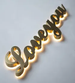
Hey there! Ever walk down a city street at night and feel instantly drawn to those glowing storefront signs? That's the magic of light letters doing their job. As someone who's spent years in the lighting industry, I've seen firsthand how the right illuminated signage can transform a business space from "meh" to "wow" in seconds.
Whether you're a coffee shop owner or launching a corporate headquarters, understanding different light letter styles is crucial. These glowing messengers work 24/7 introducing your brand, guiding customers, and shaping first impressions. Let's explore why architectural lighting solutions like these matter and how to choose what fits your vibe.
How Different Light Letters Stack Up
| Letter Type | Best For | Brightness Level | Weather Resistance | Typical Lifespan |
|---|---|---|---|---|
| Backlit Channel Letters | Storefront branding | ⭐⭐⭐⭐⭐ | ⭐⭐⭐⭐⭐ | 7-10 years |
| Front-Lit Letters | Corporate buildings | ⭐⭐⭐ | ⭐⭐⭐ | 5-7 years |
| Edge-Lit Acrylic | Lobbies & reception | ⭐⭐⭐⭐ | ⭐⭐ | 4-6 years |
| Neon-Style LED | Bars & restaurants | ⭐⭐⭐⭐ | ⭐⭐ | 5-8 years |
| Dimensional Letters | Interior feature walls | ⭐⭐ | Not recommended | 10+ years |
Meet the Five Main Light Letter Styles
1. Channel Letters: The Storefront Champions
Picture those individual metal letters mounted directly on building facades. Each character is custom-made from aluminum, stainless steel or acrylic with led lights installed inside. What makes them special? They create dimension that flat signs just can't match.
Why businesses love them: The visibility game is strong with these! When we installed channel letters for a boutique hotel last year, their nighttime walk-ins increased by 30% instantly. They come in three main variations:
- Front-Lit : Light shines through the face only
- Back-Lit : Creates a glow behind the letters (my personal favorite)
- Reverse : Illuminates the wall surface around the letter shape
2. Edge-Lit Acrylic: Modern & Sleek
These beauties look like solid glowing slabs when lit up. Made from clear acrylic sheets, LEDs along the edges create a mesmerizing internal glow effect. They're commonly used in corporate environments where sharp, minimalist design matters.
Designer tip: Edge-lit letters paired with decorative profiles in lobbies create stunning first impressions. That "wow" moment when clients enter? Priceless.
Installation notes: Though stunning, these are best for protected areas. For outdoor use, we recommend adding protective overhangs since acrylic expands in direct sunlight. They're surprisingly low maintenance though – just a soft cloth cleaning twice a year!
3. Neon-Style LEDs: Retro Charm Meets Modern Tech
Remember those iconic glowing tubes spelling out "BAR" in old movies? Modern LED versions keep that retro vibe without the fragility and high costs of actual neon. Perfect for restaurants, bars, and creative studios wanting personality.
Why choose these:
- Unlimited custom shapes (curves traditional letters can't handle)
- Extremely energy efficient (uses about 80% less power than old neon)
- Flexible installation options (mounts to walls, hangs from ceilings)
The new LED versions are game-changers. I recently visited a pizzeria using neon-style letters with programmable colors – red glow during business hours, shifting to warm gold after closing. Customers literally stop to snap photos!
4. Dimensional Letters: Adding Texture & Depth
These letters play with physical depth rather than light emission. Typically made from wood, metal or acrylic, they feature subtle LED illumination at key angles to highlight textures. They've become superstars in boutique hotels and high-end retail spaces.
Material matters: The material you choose dramatically impacts the feel:
- Stained wood = rustic warmth
- Brushed aluminum = modern efficiency
- Perforated metal = industrial edge
We recently designed dimensional letters for a bookstore using recycled wood with bronze edges. Paired with warm spotlighting, they created this incredible "literary fireplace" feel. The owner cried when she saw them lit up – that's the power of thoughtful lighting!
5. Monument Letters: Making Grand Statements
Tall, massive letters typically installed at ground level. Usually made from concrete, heavy-gauge metal or thick acrylic, with integrated LEDs creating bold silhouettes against buildings. Corporate campuses love these for creating powerful brand moments.
Installation quirks: Proper anchoring is CRITICAL. We work with structural engineers to calculate wind load, soil conditions, and foot traffic flow. Once installed incorrectly on sandy soil – letters literally shifted overnight! Lessons learned the hard way.
For commercial lighting projects requiring durability, we recommend:
- Stainless steel bases preventing rust
- Polycarbonate faces instead of acrylic (more impact-resistant)
- IP68-rated LED modules (survives rain, snow, sprinklers)
Matching Light Letters to Your Space
Restaurants & Cafés
Want customers to feel instantly welcome? Ditch harsh fluorescent lighting around your sign area. For bakeries and coffee shops, warm-toned edge-lit acrylic letters create a "fresh from the oven" glow. Edgy gastropubs? Neon-style LEDs radiating personality work wonders.
My favorite project: An ice cream parlor using pastel-lit channel letters that actually looked "frosty." How? We embedded micro-LEDs within frosted acrylic – pure magic!
Corporate Buildings
First impressions shape business relationships. For law firms or banks, dimensional letters in brushed metals convey stability. Tech companies love edge-lit lettering with customizable colors – great for highlighting company milestones!
Pro tip: Create cohesive architectural lighting solutions by matching your signage with lobby and pathway lighting. Consistent color temperature (3000K warm white works universally) creates professional harmony.
Retail Stores
Your sign competes with visual chaos. Fashion boutiques benefit from backlit letters creating "spotlight" drama on featured window displays. Big box stores? Massive monument letters visible from parking lots drive foot traffic.
Important: Align lighting with product cycles. We program LED color changes for a shoe store:
- Cool white for athletic gear
- Warm amber for leather goods
- Dramatic red for clearance alerts
Keeping Your Light Letters Brilliant
Maintenance isn't sexy, but ignoring it leads to embarrassing "half-lit" situations. Prevent lighting fixtures failures with:
Seasonal Cleaning Checklist
- Spring : Check for winter water damage & insect nests
- Summer : Clean acrylic faces to prevent UV haze
- Fall : Clear leaf debris blocking vents
- Winter : Verify weather seals before freezing temps
Spotting Trouble Early
Watch for these warning signs:
- Flickering sections = failing power supply
- Color shifts = LED degradation
- Dark spots = moisture invasion
Real talk: Expect to replace power drivers every 3-5 years. Quality LED modules should last 7+ years, but cheap ones fail much faster. That "too good to be true" quote? Probably uses bargain-bin components.
Making Your Lighting Decision
Choosing light letters isn't about picking the prettiest option – it's about solving communication challenges beautifully. Ask yourself:
- Who needs to see this (customers, employees, traffic)?
- What feeling should it create (welcoming, premium, playful)?
- What's my maintenance tolerance level?
Remember the café with "frosty" ice cream letters? We achieved that by combining channel letter construction with edge-lighting techniques. Sometimes magic happens when styles blend!
Whatever direction you choose, partner with designers who ask questions first. Great lighting fixtures aren't just products – they're conversations shaped in light. And when done right, those conversations keep glowing beautifully for years.










