

Picture walking into a room that instantly feels welcoming yet sophisticated. What creates that magic? More often than not, it's the wall panels setting the emotional tone. Choosing between dark and light WPC wall panels isn't just about aesthetics – it's about creating spaces that tell your story while standing the test of time.
Unlike traditional materials, WPC panels give you incredible flexibility but come with unique considerations. The shade you pick dramatically affects how spacious a room feels, how often you'll need maintenance, and even how light interacts with surfaces throughout the day. Through this comparison, we'll uncover how to make choices that deliver both beauty and practicality.
Key insight: The average homeowner replaces or repanels walls due to appearance issues every 7-9 years. Choosing the right color and material upfront can double this lifespan.
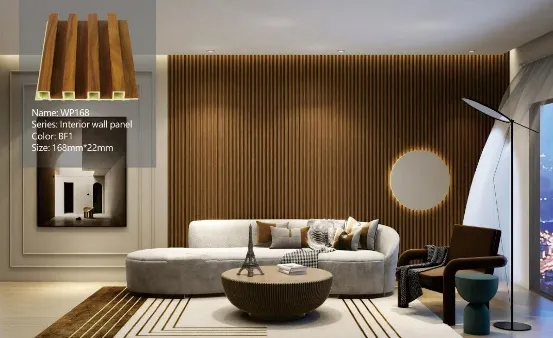
Light WPC panels act like visual magicians in interior spaces. Choosing creamy whites, soft beiges, or pale grays creates an impression of airiness that's perfect for smaller rooms or areas lacking natural light. These shades work like reflectors, bouncing sunlight around to eliminate dark corners.
Designers often turn to light panels in contemporary settings where clean lines and minimalist concepts reign. The neutrality provides the perfect backdrop for bold furnishings or artwork to pop. In one kitchen remodel we analyzed, using pearl-white panels made the space appear 30% larger without changing dimensions.
Light colors create depth illusions, push walls visually outward, and make low ceilings feel taller.
Perfect for Scandinavian, coastal, farmhouse, and minimalist decors where brightness is key.
Reflects up to 85% of natural light compared to 15-20% for dark panels, reducing lighting costs.
There's something undeniably captivating about deep espresso, charcoal gray, or navy WPC panels. These rich tones create intimate, enveloping atmospheres in ways light colors simply can't match. Luxury spaces often leverage this sophistication factor - think high-end hotels or boutique restaurants.
Beyond aesthetics, dark panels possess a unique chameleon quality. Under natural light, they appear dynamic and vibrant; in evening lighting, they become moody and atmospheric. One designer trick? Using deep-toned panels in large rooms to make expansive spaces feel cozier and more human-scaled.
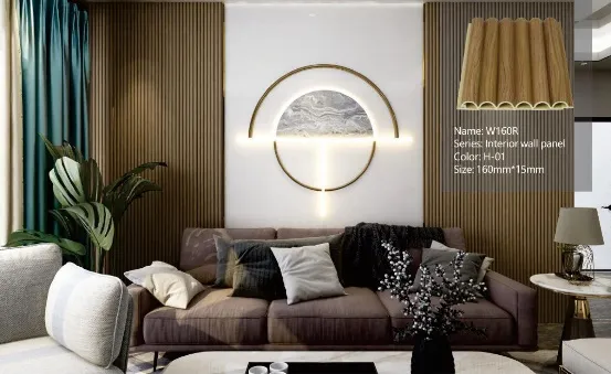
Let's get real about keeping panels beautiful. Maintenance needs vary dramatically based on color selection:
| Maintenance Factor | Light-Colored WPC | Dark-Colored WPC |
|---|---|---|
| Dust & Scratches Visibility | Low visibility - dust blends with light surfaces | High visibility - shows dust like a dark car |
| Stain Resistance | Shows coffee, oil stains dramatically | Hides most liquid spills effectively |
| UV Fading Resistance | Fading less noticeable | Color change more apparent over time |
| Cleaning Frequency Needed | Every 2-3 weeks for visible areas | Weekly cleaning recommended |
| Ideal Cleaning Solution | Mild soap + water | Anti-static cleaners recommended |
Homeowners using wpc wallboard in mudrooms report 40% less frequent cleaning when using dark panels despite dust visibility - all thanks to superior stain hiding for high-traffic areas.
"But won't dark panels fade badly?" This common concern deserves attention. Premium WPC panels incorporate UV inhibitors that dramatically slow fading. Performance varies though:
Lighter panels for small spaces, dark lowers with light uppers create visual balance.
Deep blues or charcoal create sanctuary feeling - pair with adequate lighting.
Lighter tones prevent mildew visibility, though ventilation quality matters more.
Who says you must choose one? Clever designers combine both for stunning effects:
Vertical two-tone installations create height illusions without overwhelming. Try:
Current trend: Mixed-color installations increased 65% in designer projects over last two years according to architectural surveys.
Color dramatically affects installation success. Light panels tend to be more forgiving with seams and slight imperfections. Dark panels demand greater precision:
Always install sample panels on-site! Artificial lighting stores deceive color perception. View 24"x24" samples vertically on walls at different times of day.
Beyond aesthetics, consider environmental factors:
Light panels reflect heat while dark absorbs - significant impact on interior comfort.
Darker pigments often require more processing and stronger chemicals.
Properly maintained, both types last decades, diverting waste from landfills.
As we've explored, there's no universal "better" choice between light and dark WPC panels - only what's better for your unique situation. Consider this decision framework:
Many homeowners report "color regret" within six months when choosing based solely on trends. Your perfect shade balances practicality with personal resonance.
Walking through this journey of dark versus light WPC panels reveals something beautiful: design decisions are deeply personal and experiential. The panels lining your walls aren't just practical surfaces - they're canvases that shape daily experiences.
Whether you choose the calming embrace of cloud-white panels or the sophisticated depth of graphite-gray, remember that the best choices balance:
Your walls provide the backdrop for life's moments - make that backdrop intentional.
Recommend Products











