Exploring the evolving palette of terrazzo tiles and their impact on modern spaces
Terrazzo, a material born from the ingenuity of recycling and artistic expression, has transcended centuries to remain a staple in contemporary design. Composed of chips of marble, granite, glass, or other aggregates embedded in a binder (traditionally cement or epoxy), terrazzo offers a unique blend of durability, customization, and aesthetic versatility. Today, as homeowners and businesses alike seek materials that tell a story while meeting functional needs, terrazzo has experienced a remarkable resurgence. Central to this revival is the evolution of color trends, with neutral tones and bold accents emerging as defining elements of modern terrazzo tile solutions. Whether you're a homeowner renovating a kitchen or a commercial developer designing a hotel lobby, understanding these color dynamics is key to leveraging terrazzo's full potential—and partnering with the right terrazzo tile supplier ensures access to the latest trends and highest quality materials.
The roots of terrazzo stretch back to ancient Egypt, where artisans mixed marble scraps with clay to create rudimentary flooring. By the Renaissance, Italian craftsmen refined the technique, using marble chips and lime mortar to adorn palaces and churches with intricate patterns. In the 20th century, terrazzo became synonymous with mid-century modern design, celebrated for its sleek, monochromatic look—think white or gray bases with subtle flecks of black or beige. However, as design trends shifted toward minimalism and bold expression in the 21st century, terrazzo's color palette expanded dramatically. Today, terrazzo tile solutions encompass everything from soft, earthy neutrals that evoke calm to vibrant, eye-catching accents that make a statement. This evolution reflects a broader shift: terrazzo is no longer just a flooring material but a canvas for color, capable of transforming spaces into reflections of personality and purpose.
Color is more than a visual detail in terrazzo—it's a tool that shapes mood, perception, and functionality. In residential spaces, warm neutrals can make a living room feel cozy and inviting, while cool tones in a bathroom can create a spa-like atmosphere. For commercial settings, bold accents might reinforce brand identity (a café using terrazzo in its signature teal, for example), while muted hues in an office can promote focus. As a terrazzo tile supplier, we've observed how the right color choice can turn a functional floor or wall into a focal point, enhancing the overall design narrative of a space. Moreover, color impacts practical considerations: lighter tones can brighten small rooms, darker shades hide wear in high-traffic areas, and reflective aggregates (like glass or metallic chips) add depth and light play. In short, color is the language through which terrazzo communicates with its environment.
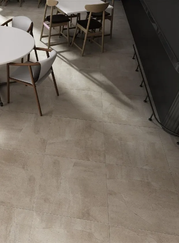
Neutrals have long been the backbone of terrazzo design, valued for their ability to complement diverse styles and stand the test of time. Unlike fleeting trends, neutral terrazzo tile solutions offer a blank canvas that adapts to changing decor, making them a favorite among residential building materials suppliers and commercial developers alike. Today's neutral palette, however, is far from monotonous—it's nuanced, with subtle undertones and texture variations that add depth without overwhelming a space.
Warm neutrals dominate residential spaces, where creating a sense of comfort is paramount. Think soft beiges with hints of peach, warm taupes that mimic sand dunes at sunset, or creamy whites infused with buttery undertones. These colors pair effortlessly with wood accents, natural textiles, and earthy metals like brass or copper, fostering a cozy, lived-in feel. For example, a kitchen floor featuring warm neutral terrazzo with caramel marble chips and a matte finish can complement oak cabinetry and terracotta backsplashes, creating a space that feels both timeless and welcoming. As a residential building materials supplier, we often recommend warm neutrals for bedrooms and living rooms, where their ability to reflect natural light can make even small spaces feel airy and expansive.
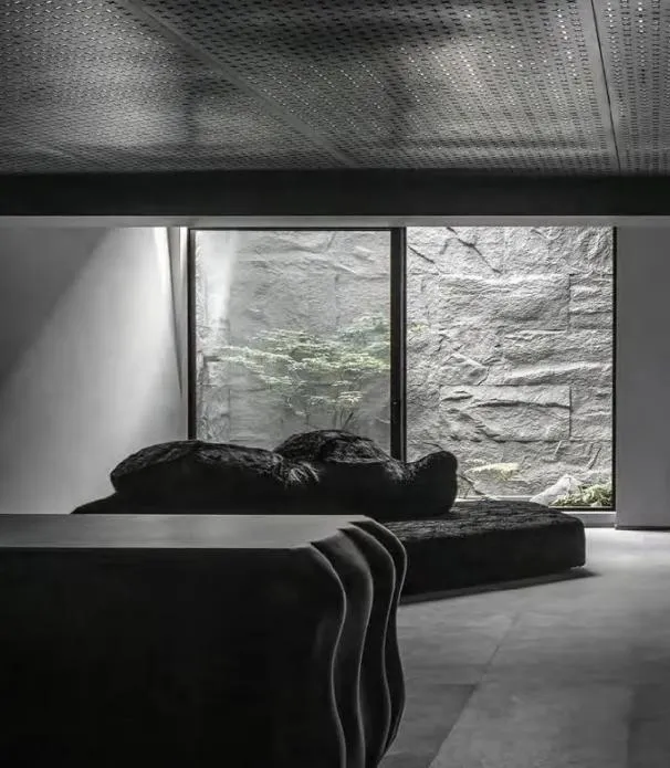
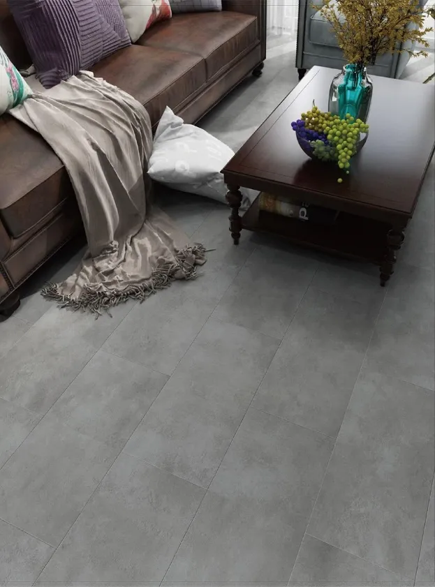
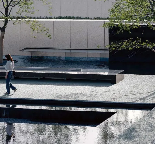
In commercial settings—offices, boutiques, and modern restaurants—cool neutrals reign supreme for their sleek, professional aesthetic. Icy grays, slate blues, and crisp whites with subtle blue or green undertones convey sophistication and calm, making them ideal for environments where focus or relaxation is key. Imagine a corporate lobby with cool gray terrazzo flooring, embedded with glass chips that catch the light like starlight, paired with black metal fixtures and minimalist furniture—the result is a space that feels both cutting-edge and timeless. Cool neutrals also excel in high-traffic areas, as their ability to hide scuffs and stains ensures long-lasting beauty. Commercial building materials suppliers often prioritize cool neutrals for retail spaces, where they serve as a neutral backdrop that lets merchandise take center stage.
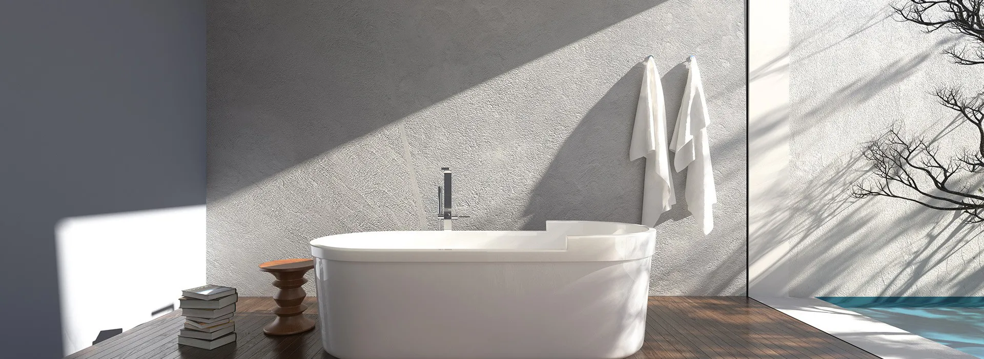
As biophilic design gains traction, earthy neutrals have emerged as a bridge between indoor and outdoor spaces. Sage greens that echo forest floors, terracottas reminiscent of desert landscapes, and soft browns that mimic tree bark bring a sense of the outdoors inside, promoting wellbeing and tranquility. These tones work beautifully in spaces like yoga studios, wellness centers, or residential sunrooms, where the goal is to create a harmonious connection with nature. For instance, a bathroom featuring terrazzo tiles in earthy sage with embedded river stone chips can transform a functional space into a spa-like retreat, complete with potted plants and natural stone countertops. Earthy neutrals also align with sustainable design trends, as they often incorporate recycled aggregates, reinforcing a commitment to eco-friendliness—a selling point for both residential and commercial clients.
While neutrals provide the foundation, bold accents are the spice of modern terrazzo design. These pops of color—whether vibrant jewel tones, playful pastels, or striking metallics—add personality, drama, and focal points to spaces, transforming terrazzo from a background element into a conversation starter. Bold accents are not about overwhelming a room but about strategic contrast, and today's terrazzo tile solutions offer endless possibilities for creative expression.
Jewel tones—emerald green, sapphire blue, ruby red, and amethyst purple—are making waves in high-end commercial and residential projects. These rich, saturated colors add a touch of luxury and drama, often used in accent walls, backsplashes, or custom terrazzo furniture. For example, a boutique hotel might feature a reception desk clad in emerald green terrazzo with gold glass chips, creating a focal point that exudes opulence. In residential spaces, jewel-toned terrazzo can elevate a powder room: imagine a vanity top in deep sapphire terrazzo paired with brass fixtures and a white subway tile backsplash—the contrast is striking yet balanced. When working with jewel tones, less is often more; a little goes a long way in creating impact without overwhelming the senses.
Pastels have shed their "girly" reputation to become a versatile choice for adding subtle color to terrazzo. Soft mint, blush pink, lavender, and baby blue inject playfulness and warmth into spaces without being too loud, making them perfect for nurseries, cafes, or creative studios. A children's playroom with blush pink terrazzo flooring featuring white marble chips and a glossy finish can feel cheerful and durable, standing up to spills and scuffs while maintaining a whimsical vibe. In commercial settings, pastels are used to create Instagram-worthy moments—think a café with mint green terrazzo countertops and matching stools, where customers are drawn to the space's fresh, inviting aesthetic. As a terrazzo tile supplier, we've seen pastel accents become particularly popular in co-working spaces, where they balance professionalism with creativity.
Metallic accents add a touch of glamour to terrazzo, whether through gold, silver, bronze, or copper chips. These reflective elements catch light, creating dynamic visual interest that shifts throughout the day. In residential spaces, metallic terrazzo is often used in small doses: a fireplace surround with gold glass chips embedded in warm white terrazzo, or a powder room floor with silver flecks that mimic moonlight. In commercial settings, metallic accents elevate luxury spaces—think a high-end restaurant with a bar top featuring bronze terrazzo and mirrored aggregates, where the material shimmers under pendant lights, enhancing the dining experience. Metallic terrazzo also pairs well with bold colors, adding depth to jewel tones or softening pastels, making it a favorite among designers looking to add layers to their palettes.
The magic of terrazzo lies in its ability to balance neutrals and bold accents, creating spaces that feel cohesive yet dynamic. Designers often follow the 80/20 rule: 80% neutral terrazzo to establish a base, and 20% bold accents to add personality. For example, a living room with warm neutral terrazzo flooring (80%) could feature a fireplace hearth in emerald green terrazzo (20%), tying the space together without clashing. Alternatively, a commercial lobby might use cool gray terrazzo for 80% of the flooring, with a bold blue terrazzo inlay forming a geometric pattern near the entrance—guiding visitors' eyes and adding visual interest.
Texture also plays a role in balancing colors. A matte neutral terrazzo can ground a space, while a glossy bold accent adds contrast and dimension. Similarly, varying aggregate sizes—large marble chips in neutrals and small glass chips in bold accents—creates tactile interest that enhances the color story. The key is to ensure that neutrals and bolds share a common undertone: warm neutrals pair best with warm bolds (e.g., terracotta with ruby), while cool neutrals complement cool bolds (e.g., slate gray with sapphire).
| Trend Type | Color Palette Examples | Best For | Mood Created | Maintenance Tips |
|---|---|---|---|---|
| Warm Neutrals | Buttercream, caramel, peach-infused beige | Bedrooms, living rooms, kitchens | Cozy, inviting, nostalgic | Sweep regularly; seal yearly to prevent staining |
| Cool Neutrals | Icy gray, slate blue, crisp white (blue/green undertones) | Offices, boutiques, lobbies | Sleek, professional, calming | Use pH-neutral cleaners; avoid harsh chemicals |
| Earthy Neutrals | Sage green, terracotta, soft brown | Wellness centers, sunrooms, yoga studios | Grounding, tranquil, nature-connected | Wipe spills immediately; polish with stone-safe products |
| Jewel Tones | Emerald, sapphire, ruby, amethyst | Accent walls, reception desks, backsplashes | Luxurious, dramatic, opulent | Seal frequently; avoid direct sunlight to prevent fading |
| Pastel Accents | Mint, blush, lavender, baby blue | Nurseries, cafes, creative studios | Playful, fresh, uplifting | Use gentle cleaners; buff out scratches with fine-grit sandpaper |
| Metallic Accents | Gold, silver, bronze, copper flecks | Fireplace surrounds, vanity tops, bar tops | Glamorous, dynamic, reflective | Dust regularly; avoid abrasive cleaners that scratch metal chips |
Terrazzo's versatility shines in both residential and commercial settings, with color trends adapting to meet the unique needs of each. For residential spaces, the focus is on comfort, personalization, and longevity. Homeowners often opt for neutral terrazzo flooring solutions in high-traffic areas like entryways and kitchens, where durability is key, while adding bold accents in smaller spaces like powder rooms or mudrooms to express personality. A homeowner working with a residential building materials supplier might choose warm neutral terrazzo for their kitchen floor and a custom pastel terrazzo backsplash, creating a space that's both practical and reflective of their style.
Commercial spaces, by contrast, prioritize brand identity, durability, and customer experience. A boutique clothing store might use cool neutral terrazzo flooring to keep the focus on merchandise, while incorporating a bold jewel-toned terrazzo inlay at the entrance to reinforce brand colors. Hotels and restaurants leverage terrazzo's customizability to create memorable spaces: imagine a hotel corridor with earthy neutral terrazzo featuring subtle metallic accents that guide guests toward rooms, or a restaurant bar top in bold blue terrazzo with glass chips that mimic the ocean, enhancing the venue's coastal theme. As a commercial building materials supplier, we collaborate with architects and designers to ensure terrazzo color choices align with brand values—whether that's sustainability (earthy neutrals with recycled aggregates) or luxury (jewel tones with marble chips).
The success of any terrazzo project hinges on partnering with a reputable terrazzo tile supplier that understands both color trends and material quality. When selecting a supplier, prioritize those with a diverse range of terrazzo tile solutions, from classic neutrals to on-trend bolds, and the ability to customize aggregates and binders to match specific color requests. Look for suppliers who source high-quality aggregates—consistent chip size, vibrant colors, and durable binders—ensuring your terrazzo stands the test of time.
Experience in both residential and commercial projects is also critical. A supplier familiar with residential needs can recommend warm neutrals that hide wear in family homes, while one with commercial expertise will know which cool neutrals and bold accents comply with high-traffic durability standards. Additionally, inquire about sustainability practices: leading terrazzo tile suppliers now offer eco-friendly options, such as recycled glass chips and low-VOC binders, aligning with green building certifications like LEED.
Finally, assess customer support. A reliable supplier should provide samples, color matching services, and technical guidance on installation and maintenance. Whether you're a homeowner embarking on a kitchen renovation or a developer designing a commercial complex, a partner who takes the time to understand your vision and budget will ensure your terrazzo tile solutions exceed expectations.
As we look to the future, terrazzo's color palette will continue to evolve, blending timeless neutrals with bold, creative accents to meet the diverse needs of modern spaces. Whether you're drawn to the calming embrace of warm neutrals, the sleek sophistication of cool tones, or the drama of jewel-toned accents, terrazzo offers endless possibilities to infuse personality and functionality into any environment. By understanding these trends and partnering with a trusted terrazzo tile supplier, you can transform ordinary spaces into extraordinary ones—spaces that tell a story, evoke emotion, and stand the test of time.
In the end, terrazzo is more than a flooring or wall material; it's a canvas for color, a testament to sustainability, and a bridge between past and present. As neutrals and bold accents continue to dance together in contemporary design, one thing is clear: terrazzo's colorful journey is far from over.
Recommend Products