Walk down any street in a modern city, and you'll notice something striking: buildings aren't just structures anymore. They're stories. And the first chapter of that story? The façade. More than just a protective shell, a building's exterior color sets the mood, reflects its purpose, and even influences how we feel when we pass by. In contemporary design, where form and function dance in harmony, color trends for façades have become a language—one that speaks to sustainability, community, and the human need for connection. From the warm embrace of earthy tones to the bold statements of biophilic hues, today's façade color palettes are about more than aesthetics; they're about creating spaces that matter. Let's dive into the trends shaping the faces of our cities, and how materials like architectural façade solutions are bringing these visions to life.
If there's one trend that feels like a warm hug, it's the revival of earth tones. Think soft terracottas that echo sunbaked clay, muted olive greens that blend with park landscapes, and warm beiges that mirror desert sands. Why the return? In a world dominated by screens and fast-paced living, people crave connection to the natural world—and earthy colors deliver that instantly. They're timeless, versatile, and surprisingly adaptable, working as well on a cozy residential building as they do on a sprawling commercial complex.
What's driving this trend even further is the rise of materials that mimic nature's textures without harming the planet. Take mcm flexible cladding stone wall panel solutions, for example. These panels are engineered to replicate the look and feel of natural stone—think weathered limestone, rough-hewn sandstone, or smooth travertine—in a range of earthy shades. Unlike traditional stone, MCM panels are lightweight, flexible, and easy to install, making them a favorite for architects aiming to create organic, nature-inspired façades without the heavy environmental footprint. Imagine a community center in a suburban neighborhood: its façade, clad in MCM panels in a warm terracotta hue, doesn't just stand out—it blends in, like a familiar friend in the landscape. The color feels lived-in, inviting, and deeply rooted in the surrounding environment.
Real-World Example: A recent residential project in Riyadh, Saudi Arabia, embraced this trend wholeheartedly. The developer wanted a façade that felt both modern and connected to the region's desert heritage. Using mcm flexible cladding stone wall panel solutions in soft sand and terracotta tones, the building now looks like it's been shaped by the desert winds—warm, textured, and utterly at home. Residents often mention how the building "feels like a part of the landscape," a testament to how earthy colors can foster a sense of belonging.
Earth tones also play well with other materials. Pair them with wood accents or large glass windows, and suddenly you've got a façade that feels open, breathable, and grounded. It's no wonder architects are calling this trend "the new neutral"—because when you're working with colors that have existed for millennia, you can't go wrong.
Neutrals have always been a staple in façade design—they're calm, sophisticated, and let the building's architecture take center stage. But lately, designers are reimagining neutrals not as a backdrop, but as a canvas for bold, unexpected accents. Picture a building wrapped in soft dove gray or warm ivory, then punctuated by a single wall in deep navy, emerald green, or burnt orange. The effect? Striking, but not overwhelming. It's the design equivalent of a classic suit with a pop of color in the tie—polished, memorable, and full of personality.
This trend thrives on contrast, and materials like pu stone wall panel solutions are making it easier than ever to pull off. PU stone panels are lightweight, durable, and come in a spectrum of neutral shades—think creamy whites, light grays, and soft beiges—that serve as the perfect base. What's more, their textured finish adds depth, so even the "neutral" parts of the façade feel dynamic. Then, for the accent wall, architects can turn to bolder materials or colors. For instance, a corporate office might use PU stone in light gray for 90% of the façade, then add a vertical strip of terracotta MCM panels along the entrance. The result is a building that feels professional yet approachable, modern yet warm.
Why bold accents? In a sea of similar-looking buildings, a well-placed pop of color helps a structure stand out—without resorting to garishness. It also allows the building to communicate its identity. A children's hospital might use soft yellow neutrals with accents of sky blue to feel cheerful and safe; a tech startup could opt for cool grays with electric blue accents to signal innovation. The key is restraint: one or two accents, strategically placed, are enough to make a statement.
Design Insight: "Clients often ask for 'something unique but not too loud,'" says Maria Gonzalez, a Madrid-based architect specializing in commercial façades. "Soft neutrals with bold accents solve that. We recently designed a retail complex using pu stone wall panel solutions in off-white for the main façade, then added vertical red accents above each storefront. It guides the eye, creates rhythm, and makes each shop feel distinct—all while keeping the overall look cohesive."
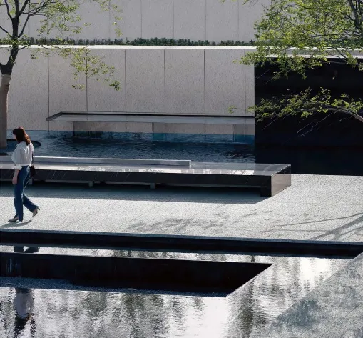
Biophilia—the human instinct to connect with nature—has been a buzzword in design for years, but it's now taking center stage in façade color trends. Biophilic hues are those inspired by the natural world: soft sage greens that mimic forest canopies, sky blues that reflect open skies, and even pale lavenders that echo dawn and dusk. These colors don't just look pretty; studies show they reduce stress, boost productivity, and create a sense of calm—making them ideal for everything from hospitals to office buildings.
When it comes to biophilic façades, terrazzo tile solutions are emerging as a star player. Terrazzo, with its speckled, marble-like appearance, can be customized to include flecks of green, blue, or even gold, creating a surface that looks like a slice of a riverbed or a sunlit meadow. Imagine a school façade clad in terrazzo tiles in soft aqua and white—students and teachers alike report feeling more relaxed, as if they're learning in a space that's connected to the outdoors. For hospitals, where calm is critical, class a fireproof cpl inorganic board for hospital and school solutions offers another biophilic option. These boards, designed for safety and durability, can be finished in muted greens or blues, turning sterile exteriors into havens of tranquility.
Biophilic colors also play a role in sustainability. By using hues that blend with the environment, buildings reduce their visual impact, making them more harmonious with their surroundings. A hotel nestled in a mountain range, for example, might use terrazzo tile solutions in slate blue and gray, mirroring the rocky landscape. Guests feel immersed in nature, even before stepping outside—and the building itself becomes part of the scenery, not a disruption.
Case Study: A hospital in Zurich, Switzerland, recently renovated its façade with class a fireproof cpl inorganic board for hospital and school solutions in soft sage green and cream. The goal? To create a space that felt less like a medical facility and more like a healing garden. Patients reported lower anxiety levels, and staff noted improved mood during long shifts. "The color isn't just decoration," says Dr. Lena Müller, the hospital's chief of staff. "It's part of our commitment to patient care. When you walk up to the building, you immediately feel calmer—and that matters."
Not all color trends are about bold hues—some are about texture and light. Metallic finishes and textured surfaces are taking façades to new heights, adding depth, drama, and a touch of luxury. Think brushed brass that glows at sunset, matte black that absorbs light for a sleek look, or copper that weathers over time, developing a rich, earthy patina. These finishes don't just add color; they play with light, making the façade change appearance throughout the day.
Architectural façade solutions are at the forefront of this trend, with manufacturers offering metallic-coated panels that combine durability with visual flair. For example, MCM panels can be finished in brushed nickel or copper, giving a modern commercial building the look of a high-end boutique. PU stone panels, too, are getting in on the action—some are now available with metallic flecks, adding subtle shimmer to neutral tones. The result? Façades that feel dynamic, almost alive, as they react to sunlight, cloud cover, and even artificial light at night.
Textured finishes are another piece of this puzzle. Rough-hewn stone looks, hammered metal textures, or even 3D patterns on panels create visual interest without relying on bright colors. A building clad in textured terracotta panels, for instance, might be entirely one color—but the way the texture catches the light makes it feel layered and complex. It's a trend that proves color isn't just about hue; it's about how light and shadow interact with the surface.
Today's color trends aren't just about looking good—they're about doing good, too. Sustainability is driving every aspect of building design, and façades are no exception. Enter sustainability-driven palettes: colors chosen not just for their aesthetic appeal, but for their environmental impact. This includes low-VOC (volatile organic compound) paints that reduce air pollution, recycled materials that minimize waste, and even colors that reflect sunlight to lower energy costs (hello, "cool roofs" in light hues).
Materials like mcm flexible cladding stone wall panel solutions and pu stone wall panel solutions are leading the charge here. MCM panels, for example, are made from recycled aluminum and natural minerals, and their durable finish means they rarely need repainting—reducing the need for harmful chemicals. PU stone panels, too, are lightweight, which cuts down on transportation emissions during installation. When paired with light, reflective colors like soft whites or pale grays, these materials help buildings stay cooler in hot climates, slashing air conditioning use and energy bills.
But sustainability-driven palettes aren't just about light colors. Darker hues can also be eco-friendly if they're paired with materials that absorb heat for passive heating in cold climates. The key is intention: every color choice is weighed against its environmental impact, from production to long-term maintenance. It's a trend that proves sustainability and beauty don't have to be mutually exclusive—in fact, they're better together.
| Material Solution | Popular Color Palettes | Key Benefits for Façades | Ideal Applications |
|---|---|---|---|
| MCM Flexible Cladding Stone Wall Panel Solutions | Earthy tones (sand, terracotta, olive), metallic finishes (copper, brushed nickel) | Lightweight, flexible, mimics natural stone, low maintenance | Residential complexes, cultural centers, commercial buildings |
| PU Stone Wall Panel Solutions | Soft neutrals (ivory, light gray), bold accents (navy, emerald) | Durable, moisture-resistant, easy to install, textured finish | Office buildings, retail spaces, hospitality venues |
| Terrazzo Tile Solutions | Biophilic hues (aqua, sage green, sky blue), neutral speckled tones | Customizable, eco-friendly, reflective, adds visual depth | Hospitals, schools, public plazas, high-end residential |
| Class A Fireproof CPL Inorganic Board Solutions | Muted greens, soft blues, warm beiges | Fire-resistant, low-VOC, hygienic, ideal for sensitive environments | Hospitals, schools, healthcare facilities |
Color trends for façades are more than just fads—they're a reflection of what we value as a society: connection to nature, balance between boldness and calm, sustainability, and the power of design to influence how we feel. Whether it's the timeless warmth of earth tones, the playful contrast of neutrals with accents, or the healing power of biophilic hues, today's façades are designed to tell stories that resonate. And with materials like architectural façade solutions, mcm flexible cladding stone wall panel solutions, and pu stone wall panel solutions leading the way, these stories are more vivid, durable, and eco-friendly than ever before. So the next time you walk down the street, take a moment to look up. The building in front of you isn't just a structure—it's a conversation. And thanks to these color trends, it's one worth listening to.
Recommend Products