

Walk into any space—a cozy home living room, a bustling hotel lobby, a serene hospital corridor—and the first thing that greets you isn't just the layout or the furniture. It's color. Color sets the mood, tells a story, and even influences how we feel: a soft blue might calm a stressed mind, a warm terracotta could spark conversation, a muted green might ground us in nature. As we step into 2025, the world of building materials is no longer just about durability or functionality; it's about color as a language—one that suppliers, designers, and homeowners are speaking together.
As a leading porcelain slab tile for wall supplier, we've spent months analyzing market shifts, collaborating with architects, and listening to the needs of spaces both big and small. What we've found is clear: 2025 is the year color gets intentional. It's not just about what's "on-trend" but what feels authentic, sustainable, and deeply human. From earthy neutrals that echo the outdoors to biophilic hues that bridge the gap between inside and out, this year's color palette is a love letter to balance—between comfort and innovation, tradition and modernity, aesthetics and purpose.
In this article, we're pulling back the curtain on the 2025 color trends shaping walls, floors, and beyond. We'll explore how materials like MCM flexible cladding stone wall panel solutions, bamboo charcoal board wall panels, and class A fireproof CPL inorganic boards are bringing these trends to life, and why they matter for spaces ranging from luxury homes to busy hospitals. Because at the end of the day, color isn't just paint on a wall—it's the heartbeat of a room.
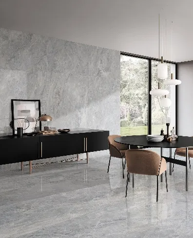
If 2024 was about bold, saturated colors, 2025 is a return to the basics—but with a twist. Earthy neutrals are back, but not the cold grays of yesteryear. Think warm beiges that mimic sun-baked sand, soft browns that evoke aged wood, and muted terracottas that feel like a hug from the desert. These are colors that don't shout; they whisper, "stay a while."
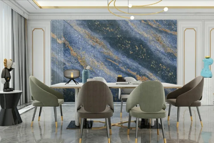
At the forefront of this trend is the porcelain slab tile for wall supplier community, where large-format slabs are stealing the show. Imagine a living room wall clad in 6mm-thick porcelain slabs in "Saharan Sand"—a creamy beige with subtle veining that mimics natural limestone. The color isn't flat; it has depth, like sunlight filtering through desert dunes. These slabs aren't just pretty, either: they're scratch-resistant, water-proof, and perfect for high-traffic areas like kitchens or entryways, where life happens (and spills, and scuffs) daily.
Then there's the bamboo charcoal board wall panel supplier segment, which is elevating earthy neutrals with sustainability in mind. Bamboo charcoal boards, made from fast-growing bamboo and activated charcoal, bring a unique warmth to spaces. Their natural color palette ranges from "Driftwood Gray" (a soft, weathered gray with golden undertones) to "Cedar Brown" (a rich, mid-tone brown that feels like a forest floor). What makes these panels special is their texture—slight grain variations that catch the light, making a neutral wall feel dynamic, not dull. In a bedroom, a bamboo charcoal accent wall in "Maple Cream" becomes a backdrop for rest, while in a home office, "Walnut Taupe" fosters focus without feeling sterile.
Pastels are no longer just for nurseries. In 2025, they're growing up—trading bubblegum pink for "Blush Rose" (a dusty pink with gray undertones), baby blue for "Dusk Blue" (a muted sky blue that feels like twilight), and mint green for "Moss Green" (a soft, sage-like hue that's equal parts calm and sophisticated). These are pastels with depth, designed to soothe, not overwhelm.
Enter MCM flexible cladding stone wall panel solutions, a game-changer for bringing muted pastels to life in commercial and residential spaces. MCM (Metal Composite Material) panels are lightweight, flexible, and infinitely customizable—meaning suppliers can match almost any pastel shade. Picture a boutique café in Riyadh with an accent wall in MCM panels colored "Lavender Mist"—a soft purple that's calming but not cloying, paired with wooden tables and fixtures. The panels are easy to install (even on curved walls) and resistant to fading, so that lavender stays fresh for years, even in sunlit spaces.
PU stone wall panel suppliers are also leaning into muted pastels, but with a textural twist. PU (polyurethane) stone panels mimic the look of natural stone—think stacked stone or river rock—but in lightweight, easy-to-install sheets. In "Shell Pink," a PU stone panel becomes a focal point in a bathroom, adding texture without the weight of real stone. The color is subtle, like seashells at low tide, and pairs beautifully with white fixtures and chrome hardware. It's pastels with personality.
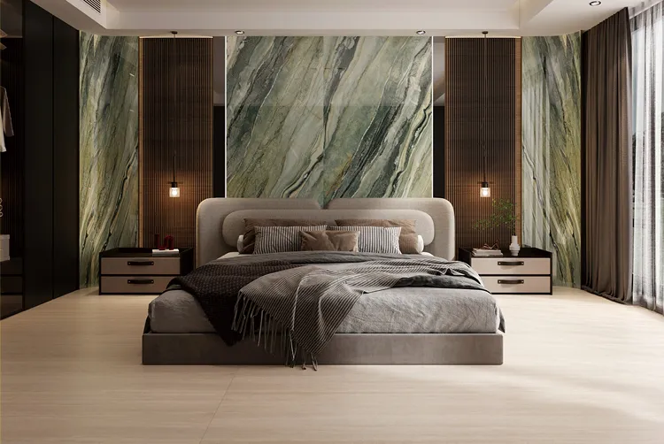
After years of indoor living, 2025 is all about biophilic design—the idea that connecting with nature improves well-being. And color is leading the charge, with hues inspired by forests, oceans, and skies taking center stage. Think "Eucalyptus Green" (a deep, earthy green with blue undertones), "Coral Reef Blue" (a muted teal that evokes shallow ocean waters), and "Cloud Gray" (a soft, airy gray that mimics overcast skies).
Nowhere is this trend more critical than in healthcare and education spaces, where color can impact healing and learning. That's where class A fireproof CPL inorganic board for hospital and school solutions come into play. CPL (Continuous Pressure Laminate) inorganic boards are fire-resistant, moisture-proof, and designed for spaces that demand safety and durability—hospitals, schools, nursing homes. But in 2025, they're also getting a color upgrade. Imagine a pediatric ward with walls clad in CPL boards in "Fern Green"—a vibrant yet soft green that feels like a walk in the park. Studies show that green spaces reduce anxiety in children, and these boards make that possible in even the most sterile environments. Similarly, a school classroom in "Sky Blue" CPL boards can boost creativity, turning a plain wall into a canvas for young minds.
For residential spaces, PU stone wall panel suppliers are embracing biophilic hues with "River Rock Beige"—a warm beige with hints of green that feels like a riverbed—and "Mountain Mist Gray," a cool gray with blue undertones that evokes misty peaks. A home's sunroom, clad in PU panels in "Ocean Spray Blue," becomes a retreat where you can almost hear waves, even in the heart of the city.
Pastels are no longer just for nurseries. In 2025, they're growing up—trading bubblegum pink for "Blush Rose" (a dusty pink with gray undertones), baby blue for "Dusk Blue" (a muted sky blue that feels like twilight), and mint green for "Moss Green" (a soft, sage-like hue that's equal parts calm and sophisticated). These are pastels with depth, designed to soothe, not overwhelm.
Enter MCM flexible cladding stone wall panel solutions, a game-changer for bringing muted pastels to life in commercial and residential spaces. MCM (Metal Composite Material) panels are lightweight, flexible, and infinitely customizable—meaning suppliers can match almost any pastel shade. Picture a boutique café in Riyadh with an accent wall in MCM panels colored "Lavender Mist"—a soft purple that's calming but not cloying, paired with wooden tables and fixtures. The panels are easy to install (even on curved walls) and resistant to fading, so that lavender stays fresh for years, even in sunlit spaces.
PU stone wall panel suppliers are also leaning into muted pastels, but with a textural twist. PU (polyurethane) stone panels mimic the look of natural stone—think stacked stone or river rock—but in lightweight, easy-to-install sheets. In "Shell Pink," a PU stone panel becomes a focal point in a bathroom, adding texture without the weight of real stone. The color is subtle, like seashells at low tide, and pairs beautifully with white fixtures and chrome hardware. It's pastels with personality.
Monochrome isn't just black and white anymore. In 2025, it's about taking a single color and playing with texture to create depth. Think matte black walls with subtle grooves, soft white panels with a "rough-hewn" finish, or gray surfaces that shift from light to dark depending on the angle. It's minimalism, but make it interesting.
MCM flexible cladding stone wall panel solutions are leading the charge here, with suppliers offering textured monochromes that transform plain walls into works of art. Imagine a restaurant in Jeddah with a feature wall in MCM panels in "Charcoal Matte"—a deep, inky black with a slight brushed texture. The panels are arranged in a staggered pattern, creating shadows that make the wall feel three-dimensional. At night, with warm lighting, the wall becomes a backdrop for conversation, its texture softening the bold color. In a modern office, MCM panels in "Alabaster White" with a sandblasted finish add elegance without feeling cold, proving that white can be just as dynamic as a rainbow.
Bamboo charcoal board wall panel suppliers are also embracing textured monochromes, using the natural grain of bamboo to add interest. A wall in "Graphite Gray" bamboo charcoal panels might look simple at first glance, but up close, the vertical grain and slight color variations (darker here, lighter there) create a sense of movement. It's a monochrome that feels alive—perfect for a home theater or a minimalist bedroom where less truly is more.
| Material | Color Range | Durability | Sustainability | Best For |
|---|---|---|---|---|
| Porcelain Slab Tiles | Earthy neutrals (beiges, browns), biophilic hues (greens, blues), monochromes (blacks, whites) | High (scratch, water, fire-resistant) | Low VOC, recyclable packaging | Kitchens, bathrooms, commercial lobbies |
| MCM Flexible Cladding Panels | Muted pastels (pinks, blues, greens), textured monochromes (matte blacks, whites) | Medium-High (weather-resistant, fade-proof) | Often made with recycled metals | Accent walls, exterior facades, restaurants |
| Bamboo Charcoal Boards | Natural wood tones (grays, browns, creams) | Medium (scratch-resistant, low moisture absorption) | Sustainable bamboo sourcing, low VOC adhesives | Bedrooms, home offices, living rooms |
| Class A Fireproof CPL Inorganic Boards | Biophilic hues (greens, blues), soft neutrals | Very High (fireproof, moisture-proof, impact-resistant) | Low formaldehyde emissions, recyclable core | Hospitals, schools, nursing homes |
| PU Stone Panels | Muted pastels, biophilic hues, earthy neutrals | Medium (lightweight, weather-resistant) | Low energy production, recyclable packaging | Bathrooms, accent walls, outdoor patios |
Let's be real: a pretty color is great, but if it fades after six months or stains with the first cup of coffee, it's not worth it. That's why 2025's color trends aren't just about looks—they're about performance. As suppliers, we're seeing a shift towards "hardworking colors" that can keep up with real life.
Take the class A fireproof CPL inorganic board for hospital and school solutions: these boards aren't just about biophilic greens or calming blues. They're designed to withstand the chaos of a busy hospital—spills, scrubbing with harsh cleaners, even the occasional bump from a gurney. Their color pigments are embedded deep into the material, so "Fern Green" stays "Fern Green" for years, not months. In a school cafeteria, where ketchup and marker stains are a daily occurrence, a CPL board in "Sandstone Beige" wipes clean with a damp cloth, no permanent damage.
Porcelain slab tile for wall suppliers are also upping their practical game. Many 2025 slabs come with "anti-fingerprint" technology, so that "Saharan Sand" wall in your kitchen doesn't become a smudge magnet. They're also heat-resistant, meaning a hot pan placed against the wall won't leave a mark. For families with kids (or clumsy adults, no judgment), that's a game-changer.
And let's not forget customization. Today's suppliers don't just offer "off-the-shelf" colors—they collaborate. A designer might walk into a bamboo charcoal board wall panel supplier's showroom and say, "I need a color that's between 'Maple Cream' and 'Driftwood Gray,' with a hint of green." Thanks to digital color-matching technology, that's possible. Suppliers can create bespoke shades, ensuring a space feels truly one-of-a-kind.
2025 isn't just about how colors look—it's about how they're made. More than ever, clients are asking, "Is this color sustainable?" And suppliers are answering with innovations that marry eco-friendliness and aesthetics.
The bamboo charcoal board wall panel supplier community is leading the way here. Bamboo is one of the fastest-growing plants on Earth, absorbing more carbon dioxide than trees and requiring no pesticides to thrive. When turned into wall panels, it's treated with natural, low-VOC adhesives, and the activated charcoal in the boards helps purify indoor air by absorbing odors and moisture. The color palette? It's derived from natural pigments—no harsh chemicals needed. "Cocoa Brown" comes from cocoa bean shells, "Olive Green" from olive leaves. It's color with a conscience.
MCM flexible cladding stone wall panel solutions are also stepping up, with many suppliers using recycled aluminum and polyethylene cores in their panels. The paint used to color these panels is often low-VOC and water-based, reducing harmful emissions. Even the packaging is getting greener—biodegradable wraps and recyclable pallets are becoming the norm.
Porcelain slab tile for wall suppliers are focusing on energy efficiency in production, using solar power to fire their kilns and recycling water used in the manufacturing process. Some are even introducing "carbon-neutral" tile lines, where the emissions from production are offset by reforestation projects. The result? A "Saharan Sand" slab that looks good and does good.
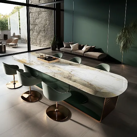
Challenge: Create a modern residential complex that feels warm and inviting, using 2025 color trends. Solution: A mix of earthy neutrals and biophilic hues, featuring porcelain slab tiles and bamboo charcoal boards. The lobby walls are clad in "Saharan Sand" porcelain slabs, while apartment living rooms use "Cedar Brown" bamboo charcoal panels. The result? A space that feels both luxurious and homey, with colors that appeal to a wide range of residents.
Challenge: Design a calming, healing environment for young patients using fire-safe materials. Solution: Class A fireproof CPL inorganic boards in "Fern Green" and "Sky Blue," paired with MCM panels in "Blush Rose" for accent walls. The biophilic hues reduce anxiety, while the CPL boards stand up to daily wear and tear. Parents report kids are more relaxed, and staff note a brighter, more positive atmosphere.
Color in 2025 isn't just about what's new—it's about what matters. It's about creating spaces that feel like home, even in a busy hospital. It's about choosing materials that don't just look good, but do good for the planet. It's about collaboration: suppliers working with designers, contractors, and clients to turn trends into tangible, meaningful spaces.
Whether you're a homeowner dreaming of a bamboo charcoal accent wall in "Maple Cream," a designer specifying MCM panels in "Moss Green" for a café, or a hospital administrator choosing class A fireproof CPL boards in "Sky Blue" for a pediatric ward, 2025's color trends are about connection—between people, spaces, and the world around us.
As a porcelain slab tile for wall supplier, bamboo charcoal board provider, and advocate for thoughtful design, we're excited to be part of this journey. Because at the end of the day, color isn't just a trend—it's how we tell our stories.
Recommend Products











