Ever notice how stepping into a room can instantly change your mood? Colors whisper secrets to our subconscious, triggering emotional responses we rarely notice. This invisible dialogue becomes especially important when designing spaces where we spend time thinking, creating, or relaxing—like areas featuring bookshelves.
Unlike the medical articles examining stool or urine colors for health signals, we're exploring how hues transform ordinary bookshelves into emotional experiences. Just as doctors read bodily colors for vital information, we can decode color psychology to design bookshelves that nourish our minds and souls.
Real-life insight: Notice how library designers use rich, warm wood tones to create feelings of wisdom and permanence? That's color psychology in action—transforming storage into storytelling.
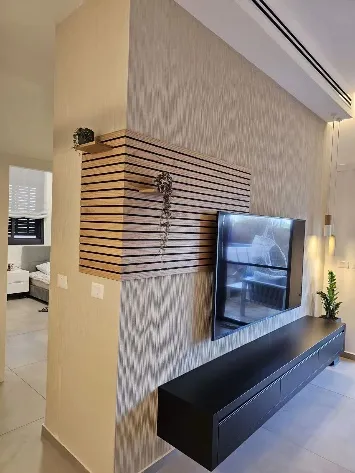
Bookshelves aren't just storage—they're focal points that anchor rooms. Their colors influence how we perceive space and interact with our environment. A stark white shelf might feel clean and modern but could leave a room feeling sterile. Meanwhile, deep mahogany shelves may create richness but risk overwhelming smaller spaces.
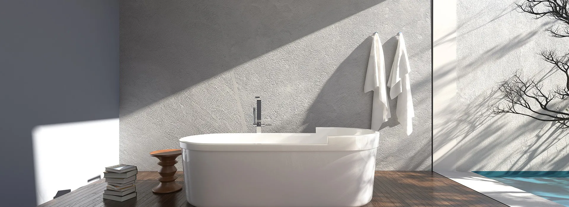
Color manipulates spatial perception in surprising ways. Light colors help cramped rooms breathe, while darker shades create intimate cocoons—valuable knowledge when choosing hues for your custom bookshelf in apartments or large rooms.
Different spaces demand different color strategies:
Like medical professionals understand what different body fluid colors indicate about health, we can learn what bookshelf colors communicate about space.
Creates airiness and modern simplicity. Perfect for small spaces but requires frequent cleaning. Pair with warm woods to avoid sterility.
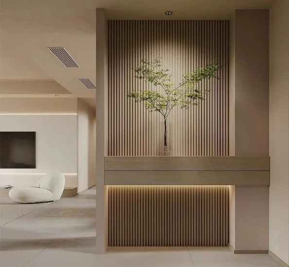
Authenticity and timelessness. Lighter woods (oak, birch) feel casual; darker woods (walnut, mahogany) convey luxury. Natural finishes highlight character.
Energizes spaces but use strategically. Deep burgundies add richness; bright accents spark creativity. Avoid overwhelming with large surfaces.
Cool tones promote calmness and concentration. Soft blues enlarge spaces; navy adds sophistication. Ideal for reading nooks and offices.
Balancing and renewing. Sage greens connect to nature; emerald adds glamour. Complements both natural materials and metallic accents.
Creates dramatic sophistication and recedes visually. Best for large spaces or as accent pieces. Pair with textures to avoid flatness.
Like bodily systems work in harmony, bookshelf colors should create flow between spaces. Repeat colors through accessories or integrate transitional hues in modular bookshelf systems to connect rooms naturally.
Strategic color accents can transform shelves from functional to focal points:
Expert trick: Notice how museum designers use accent walls? Apply the same concept by painting just your bookshelf's interior walls a contrasting hue for instant impact without commitment.
Ultimately, the best bookshelf color choice honors both psychology and practicality:
Consider your solid wood bookshelf as an evolving canvas. Natural woods may display family history through patina, while painted finishes can transform with your style.
While color psychology offers guidelines, personal connections matter most. A vibrant yellow shelf might be overwhelming in theory but could spark joy in an art lover's studio.
Like doctors look deeper than surface colors to understand health, we must look beyond aesthetics to create meaningful spaces. Your bookshelf color choice becomes an unspoken dialogue between space and psyche, transforming shelves into silent partners in daily life.
When selecting your ideal bookshelf hue, ask not just "What looks good?" but "How does this color make me feel?" That's where true design magic happens—where shelves stop being mere storage and start shaping experiences.
Recommend Products