


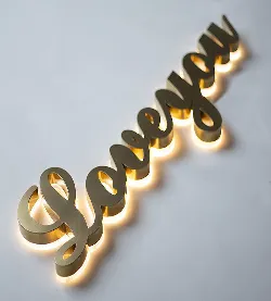
Picture walking down a city street at night. What catches your eye first? For most folks, it’s those glowing letters spelling out shop names or guiding you to an entrance. That’s light letters at work – unassuming yet vital tools for communication. But here’s the kicker: not all light letters are created equal. If you’ve ever wondered why some signs look crisp for decades while others turn into flickering nightmares, stick around. We’re diving deep into the DNA of high-quality light letters.
1. Built Tough: Materials That Outlast Trends
Cheap light letters are like cardboard umbrellas in a storm – they collapse when things get real. Top-tier options? More like fortress walls.
| Material | Why It Matters | Where You'll See It |
|---|---|---|
| Polyurethane Stone Panels | Laughs off UV rays, won't fade or crack under sun abuse | Exterior signage needing weather armor |
| MCM Cladding Panels | Lightweight but stubbornly durable – won’t warp or peel | High-end retail storefronts |
| SPC Flooring Material | Yes, flooring ! Repurposed for structural stability | Letters requiring extreme impact resistance |
Ever seen light letters that look great close-up? Thank aluminum frames. This metal refuses to rust or bulge, providing a skeleton that lasts longer than fashion trends. When manufacturers care about quality, they’ll pair tough exteriors with equally stubborn interiors.
2. Glow Goals: Lighting That Doesn't Quit
Brightness isn’t enough. How about light that stays brilliant and efficient? That’s the magic of LEDs.
LEDs vs. Old-School Bulbs: The Real Difference
- Life Expectancy : 50,000 hours vs neon’s 10,000
- Heat Generation : Barely warm vs. blistering-hot tubes
- Energy Guzzling : Sips power like tea vs. chugging like a frat party
Premium lighting fixtures inside letters make all the difference. Forget buzzing, flickering nightmares – quality LEDs give even, silent illumination. They're eco-friendly too, draining less power than that forgotten phone charger always plugged in beside your bed. For architectural lighting solutions needing wow factor without guilt, this is the secret sauce.
3. Shapeshifter Abilities: Customization That Fits Anywhere
Think light letters must be boring rectangles? Meet the chameleons of signage:
Curved Letters
Wrap around rounded building corners like they were born there
3D Contours
Cast shadows and depth that flat signs can’t touch
Miniature Markers
Downsized for subtle interior branding near ceiling panels
Integrating suspension ceiling systems with lighting? A pro tip: embed letters within the grid pattern itself. It’s like fitting puzzle pieces together – seamless and sleek. Whether it’s matching corporate colors or recreating handwritten fonts, customization options separate exceptional vendors from box movers.
4. Brains Over Brawn: Smart Features You Didn’t Know You Needed
Modern light letters aren’t just bulbs in boxes. They’ve got tricks:
Weather Sensors
Brighten automatically on gloomy days, dim when the sun’s blasting
Timed Scenes
"Good Morning" hues at opening, moody blue tones for closing
Maintenance Alerts
Texts you before failures happen – say goodbye to dead letters
Pairing them with smart bathroom equipment controls? Yes, seriously. Imagine hotel signage that syncs with lobby lighting scenes. Efficiency marries aesthetics. With commercial lighting demanding higher IQ solutions, these capabilities are becoming standard in premium builds.
5. Playing the Long Game: Sustainability & Maintenance
Forget replace-every-few-years models. Elite light letters are built like tanks:
Smart Design Choices
- Quick-release faces: Change lighting without scaffolding
- Modular wiring: Yank one section, keep the rest glowing
- Seamless seals: Block moisture like a submarine door
What Cheap Signs Suffer
- Corroded connections after 1 rainy season
- Fading colors that scream "last decade"
- Bulb replacements requiring disassembly by ninjas
Consider materials too. Waterproof flooring tech borrowed from SPC vinyl isn’t accidental – it’s genius adaptation. Why? Because when signs laugh at rain, humidity, and bird poop, maintenance costs dive while sustainability soars.
Why Splurge on Quality? (Spoiler: It Pays Off)
Opting for bargain-bin light letters feels smart… until year two. Suddenly you’re budgeting for replacements instead of reinvesting profits. Premium materials like polyurethane stone panels cost more upfront but become silent workhorses. No rust, no fade, no midwinter "Oops, half my sign died" moments.
Think longevity. A decade from now, your expensive sign still looks crisp while competitors’ replacements pile up in landfills. That’s sustainability nobody brags about but should. Integrated into architectural lighting solutions, high-caliber light letters don't just shine light – they illuminate your brand’s commitment to excellence.










